20 March 2016
I’ve been really busy with working at Stanford, applying for jobs and other fun activities, so I’ve been falling a bit behind on the posts, but I’ll hopefully catch up soon.
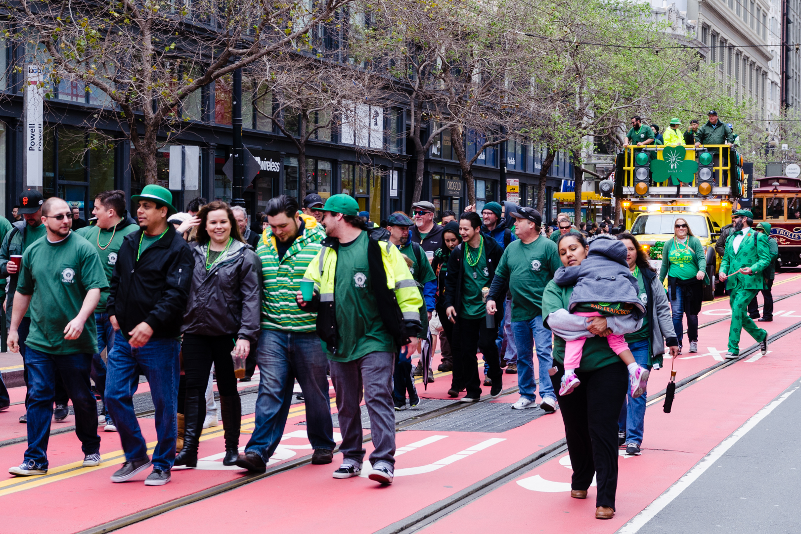
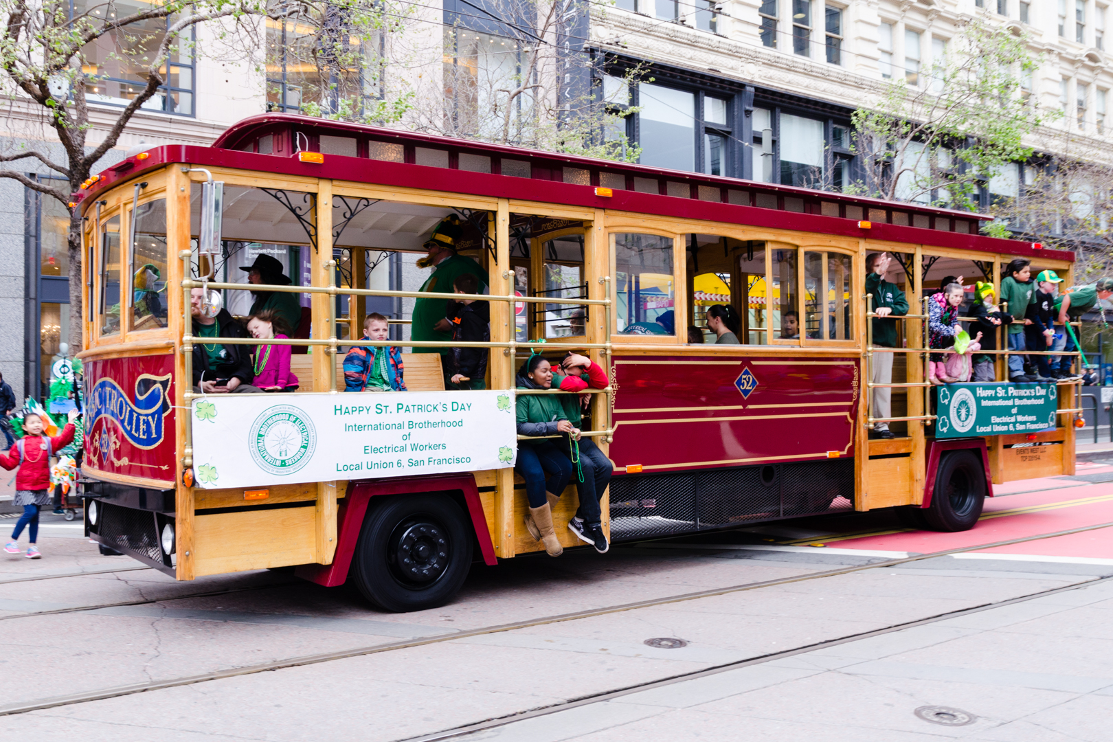
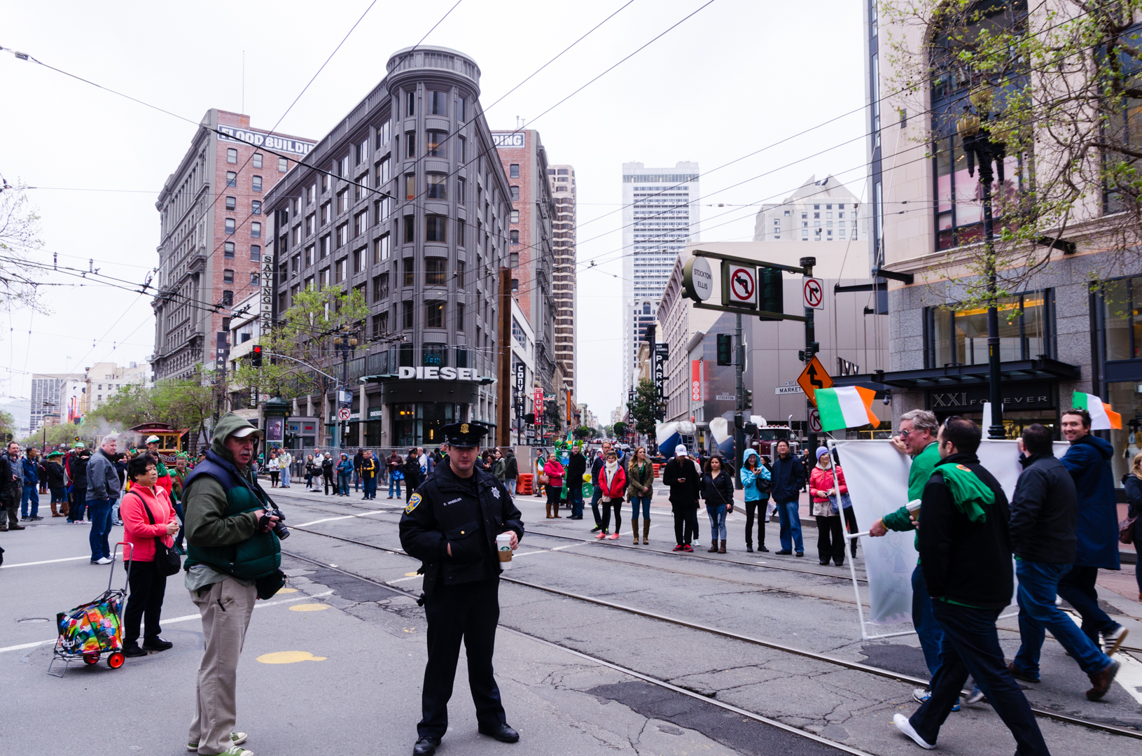
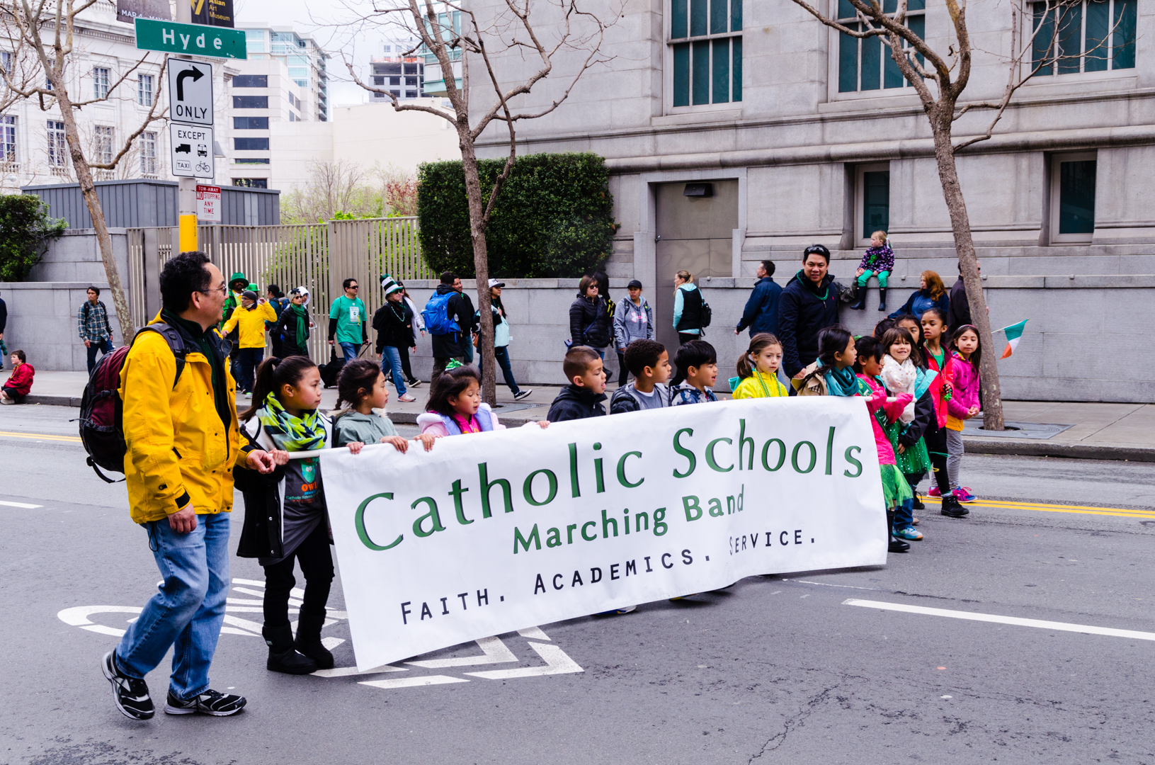
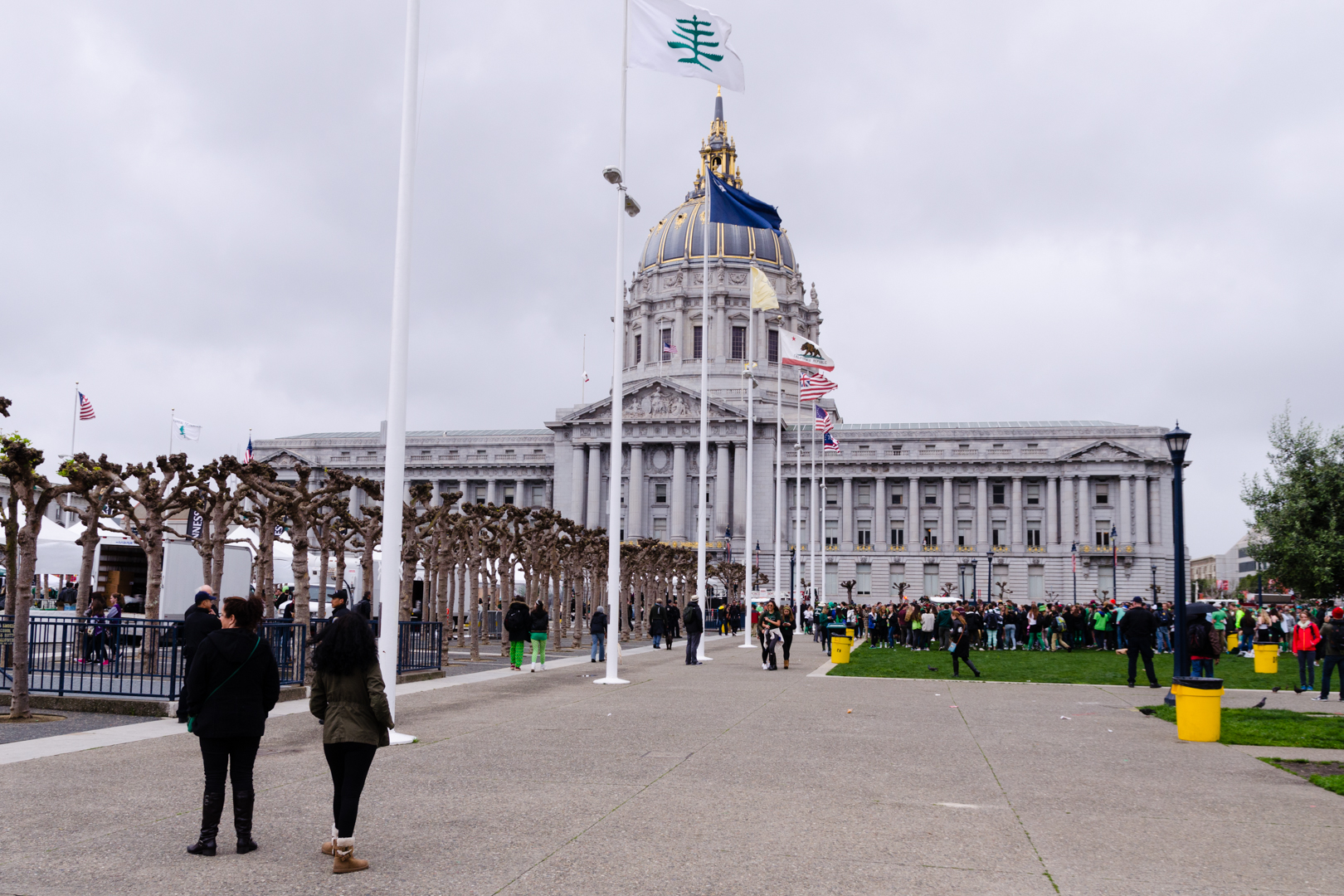
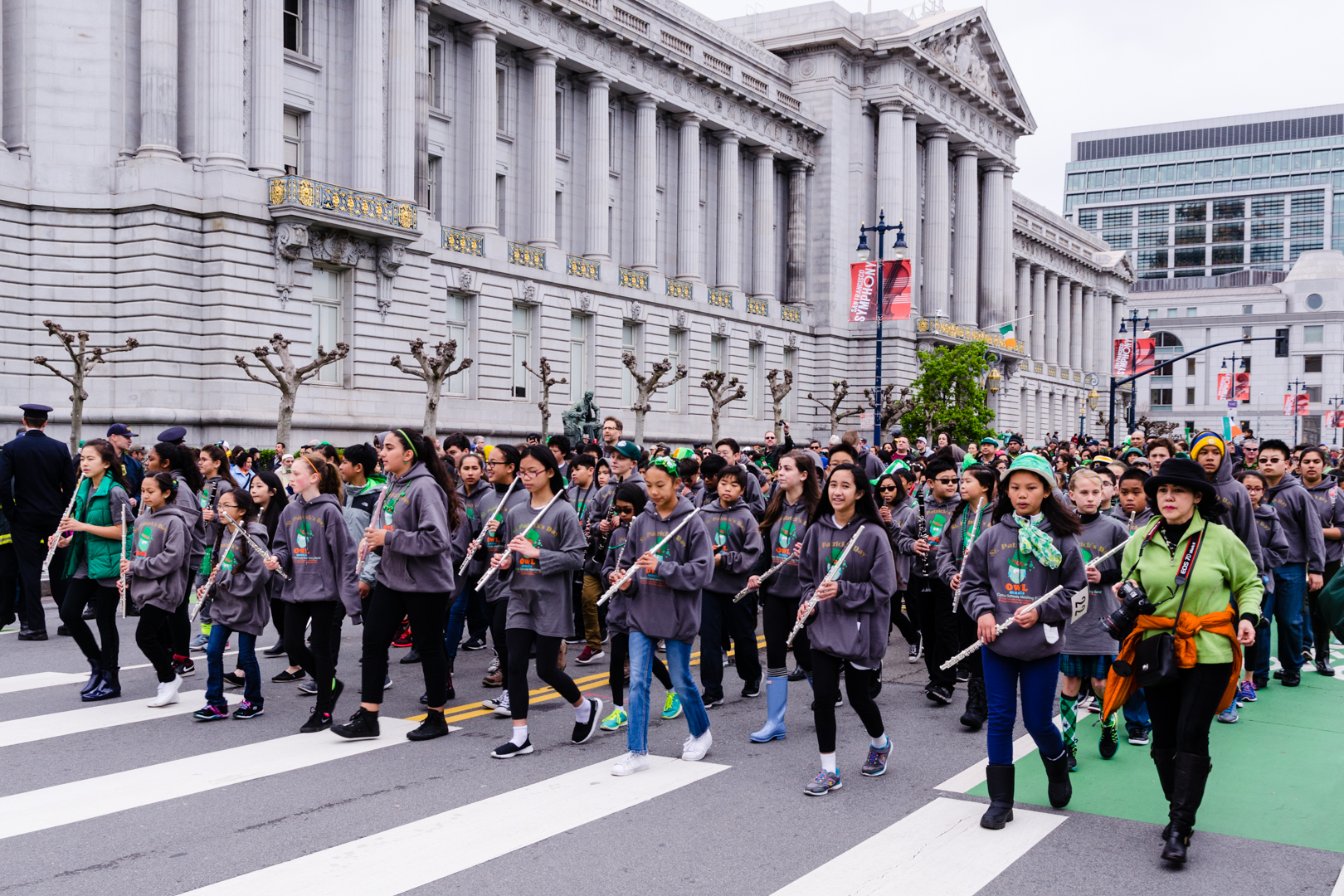
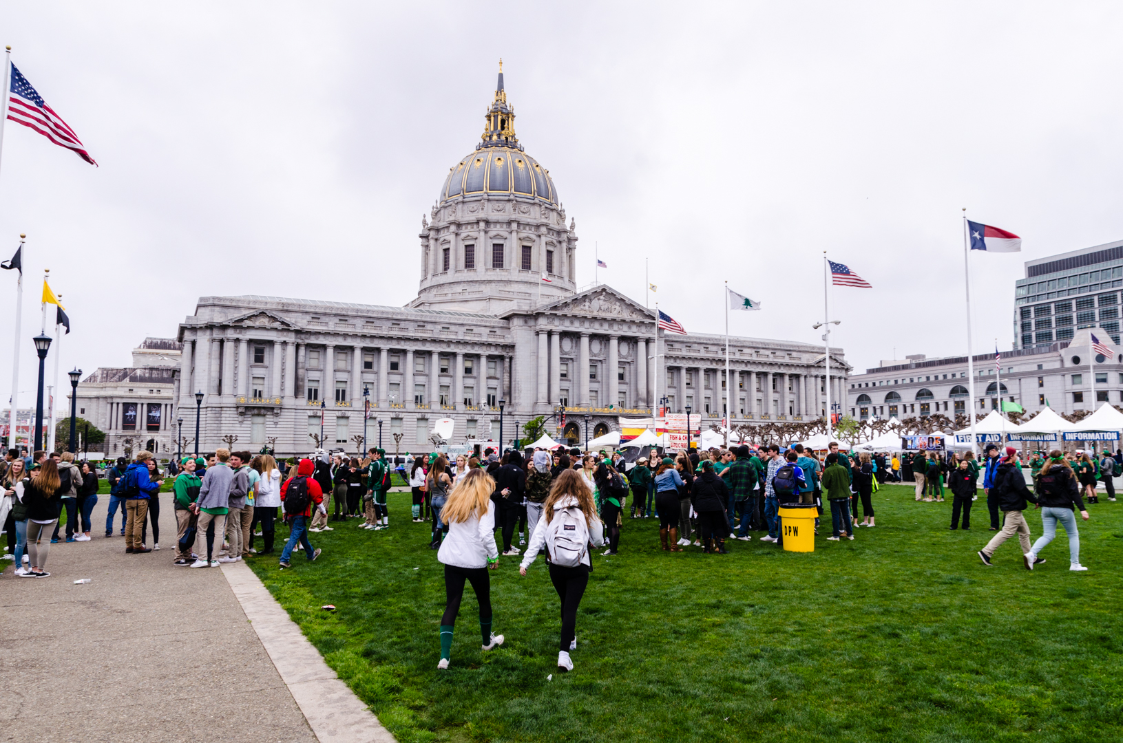
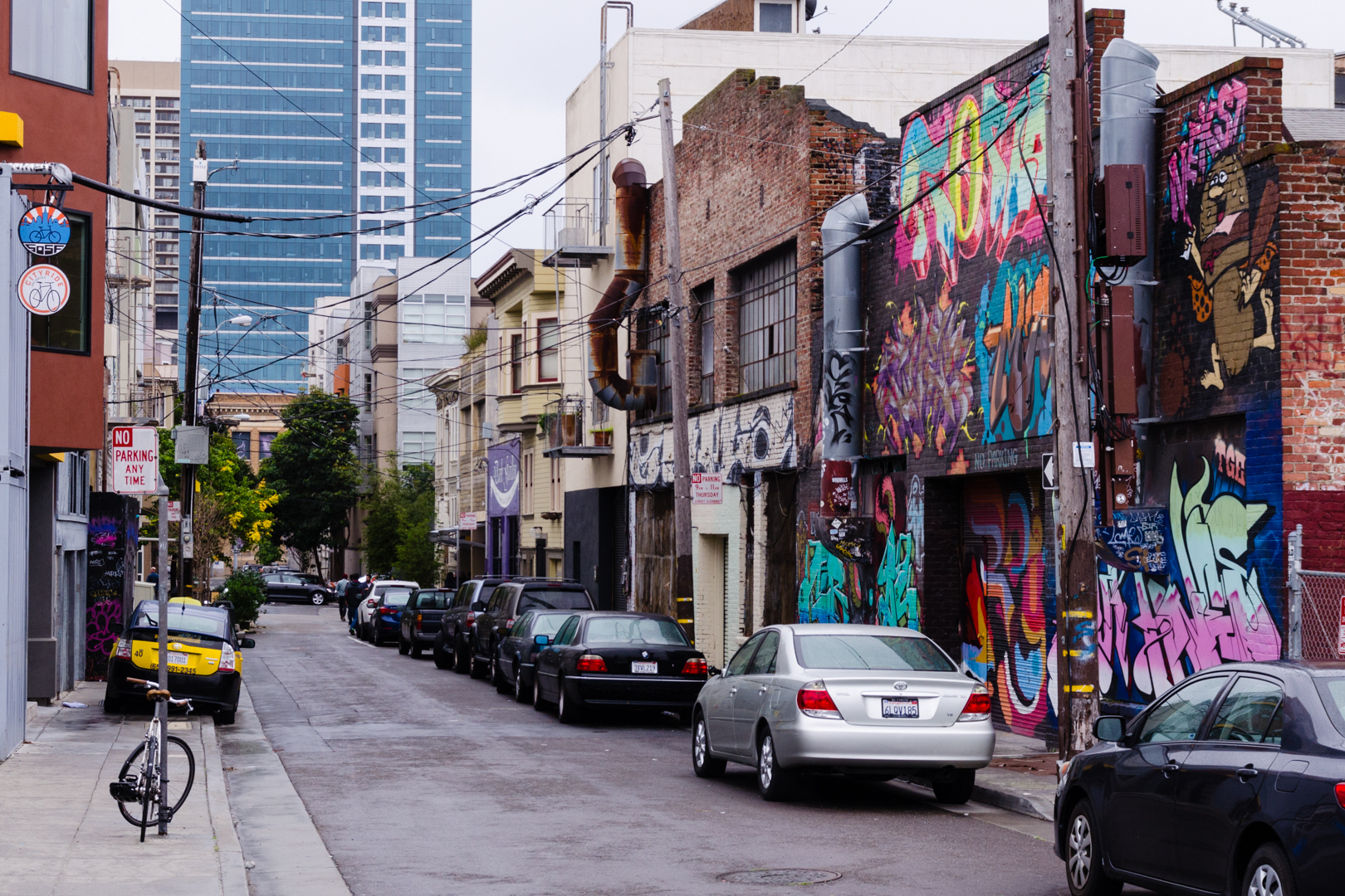
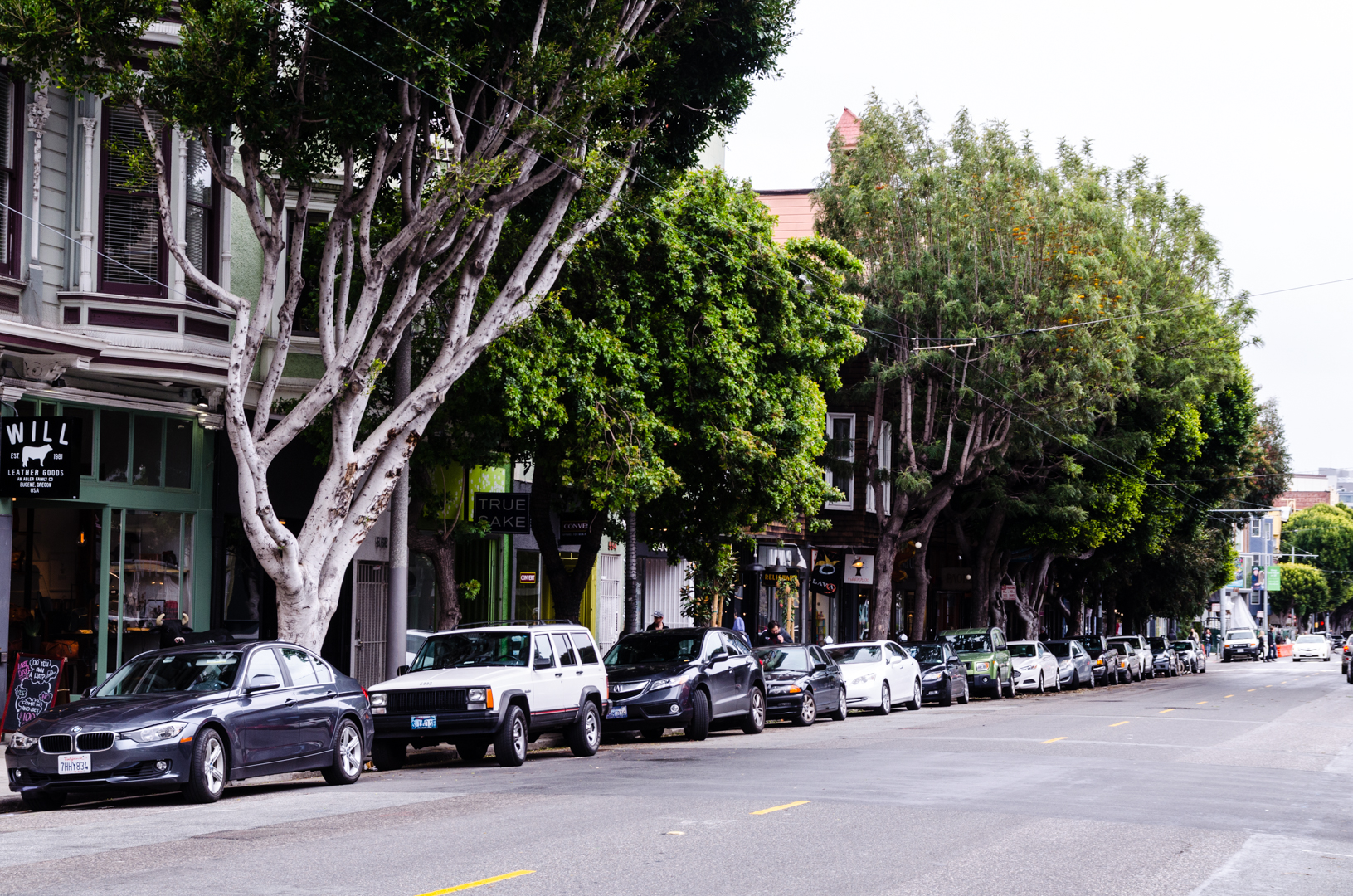
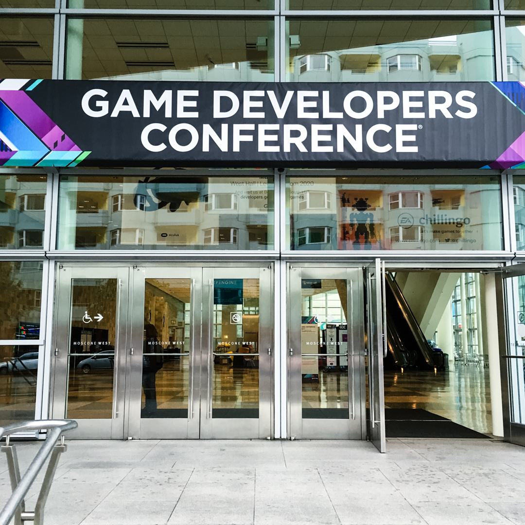
Last weekend me and Vidar went to San Francisco again, this time catching a St Patrick’s parade (half a week before the official day). It was a nice parade walking through the city that ended up at the Civic Center, where some sort of small festival was held. We walked around, grabbed some chips and looked at the teenagers ready to party and the small booths selling Guinness and food.
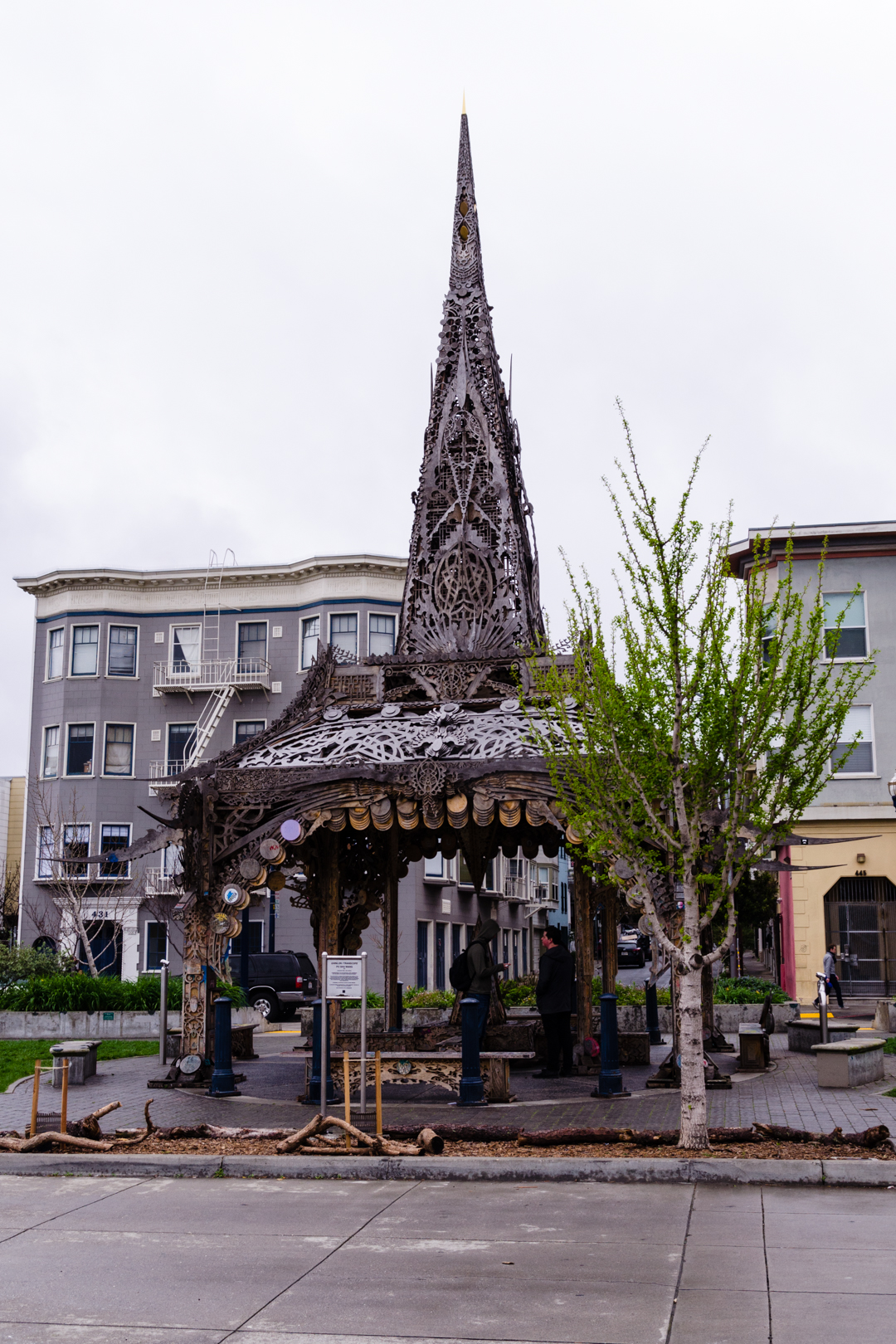
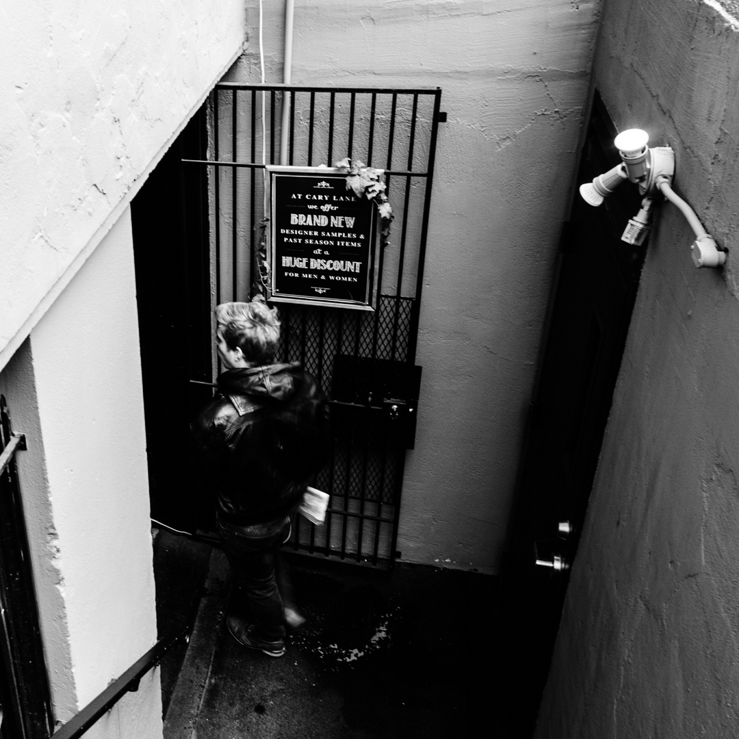
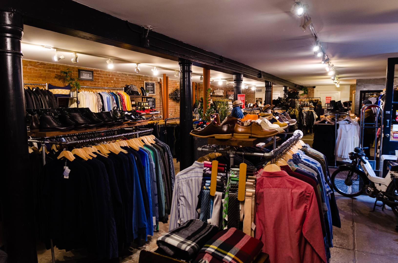
We had looked up a few interesting places to check out close to the Civic Center beforehand. We started out with a small outlet called Cary Lane. They had a lot of nice stuff for good to great prices, but unfortunately mostly big sizes. We browsed around for a while and I ended up buying a t-shirt.
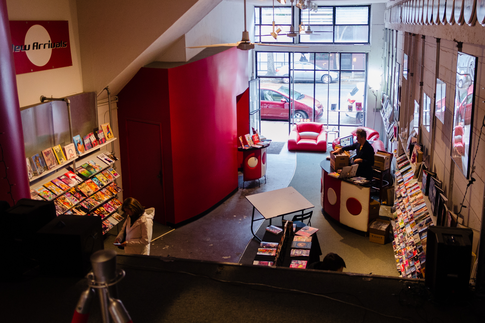
Next stop was a Isotope, the comic book lounge, a really cool comic store. I’ve really embraced my inner nerd here and gotten into comics a bit more than before. This place had a bigger focus on graphical novels and storytelling than just the usual superhero stuff, which I think is amazing. I bought a trade paperback of Watchmen and the first volume of Sandman, two classics. Vidar bought a new volume of the amazing Saga. It’s one of these comics I think lots of people who could never see themselves reading a comic at all, would probably like.
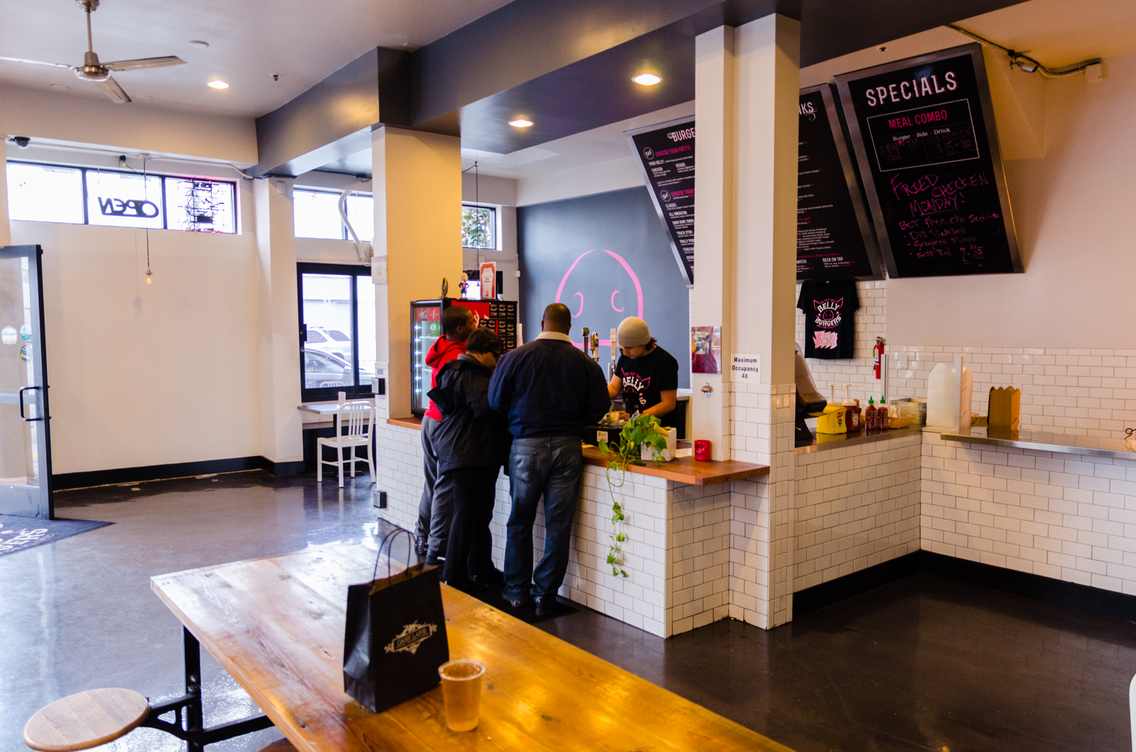
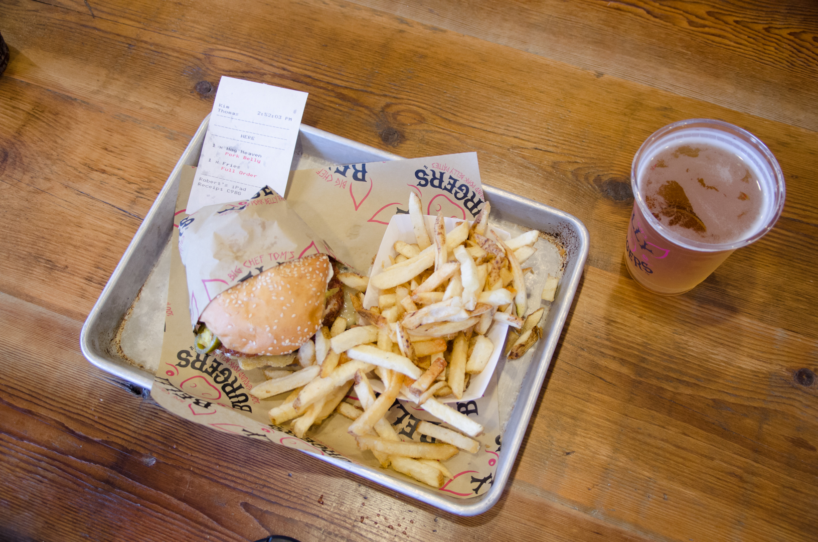
Anyway, after this it was time to go to lunch and we felt like it was time for another burger. The highest rated burger place in the nearby area has the amazing name Big Chef Tom’s Belly Burgers. The place had a cool atmosphere and the burgers were great. They had pork burgers, which was really interesting. I would still rate Super Duper Burgers higher, but not by very much.
After this we headed back to the station while the heavens opened. Luckily I packed my rain clothes, but it sure can rain here sometimes. Luckily this was one of the last rains from El Niño and now the weather is really amazing. Even better is that everything is green and beautiful now, which apparently is very different from last year’s drought.
5 March 2016
Hi there, I just wanna warn you before we even start that this post will be quite technical.
I spent a few hours on a redesign a while ago and now I feel like sharing a bit of what I have learned from all of this. You might already know this, but the browsers today are very limited to html, css and javascript, which are all old technologies oftentimes annoying to work with. Really simplified you can say that html is used for the content, css is used for the design and javascript is used for interaction with the site. Sometimes you need a big framework that sits as a layer above, hiding the old technology for the programmer, but other times you can get by using something that just removes some of the ugly parts.
I’m definitely in the latter category with this site, so I’d like to present three tools (might be a weird choice of words) that makes life easier (and most importantly much more fun) when I do things on this site. They are Markdown, sass and the iOS-Simulator.
Markdown
I write all of my posts on this site in Markdown, which is a lightweight markup language format. Html is based on tags, which are a huge pain to write all of the time. Each paragraph, link, header and picture has to be surrounded by at least one tag, which is really annoying and makes it completely impossible to have a nice writing experience. The idea behind Markdown is to provide a nice syntax for the most commonly used tags for writing posts. Then you can generate html from the Markdown files. Let’s look at a short example of a post in Markdown with a header, a paragraph with a link and a list, so that you guys understand what I mean more clearly:
My Homepage
------

My personal website can be found [here](http://kimtorberntsson.com).

Here I write about:

* Programming
* Movies
* Personal stuff
And here is the generated html:
<h2>My Homepage</h2>
<p>My personal website can be found <a href="http://kimtorberntsson.com">here</a>.</p>
<p>Here I write about:</p>
<ul>
<li>Programming</li>
<li>Movies</li>
<li>Personal stuff</li>
</ul>
Writing posts in Markdown instead of in html means that I can write my post without getting disturbed by tags and other crap. This was just a short example, and it becomes even more important if you want to use images or code blocks or something like that. I guess that I’m approaching this from a weird angle, since most people would probably just use a blog site for their blog. But it feels cool to have control over all of the code and build it from the ground up. It means that I can use html and build my own stuff if I want to, but I have these tools to handle all of the inconvenient parts elegantly.
sass
Now let’s talk a bit about css (cascading style sheets). To be blunt: it’s a hell and absolutely not intended for human beings. You would not believe how hard some things are. Centering things can be extremely frustrating and since it is one of the more common things you want to do, it just blows my mind how it can be so hopelessly stupid. You could also argue about how helpful the cascading part of css really is, but let’s not get into that now. I would definitely say that sass (synthetically awesome style sheets) is not as important for css as markdown is for html, but it’s still neat.
It has three features I really like. To start with, you can have variables. That’s right, with css you can’t! For example, I use this for the colors of the site. I define them at the top and then use them at different places in the site. And if I would like to change a color I can do it in just one line of code. The sass syntax is much nicer (which is after all what they are insinuating), since the stupid semi-colons are gone (hopefully they will all be banned from every language soon (well, who am I kidding?)) and the redundant curly braces. Lastly, you can nest properties, which makes things so much more readable.
Let’s look at an example once again, this time a real example from my blog. The header section has a navigation area with icons and text, that you can press to get to different places. With css the code looks like this:
header nav {
    height: 6em;
    background: white;
    text-align: center;
}

header nav ul li {
    display: inline-block;
    width: 4em;
    margin: 0.5em;
    text-align: center;
    font-weight: 200;
}

header nav ul li a .svg {
    height: 3em;
    width: 3em;
}

header nav ul li:hover > a {
    opacity: 0.9;
}
and the sass code that generates the same css looks like this:
header
    nav
        height: 6em
        background: white
        text-align: center
        ul
            li
                display: inline-block
                width: 4em
                margin: 0.5em
                text-align: center
                font-weight: 200
                a .svg
                    height: 3em
                    width: 3em
            li:hover > a
                opacity: 0.9
Note how much esthetically pleasing and readable it is now. It’s called cascading style sheets, so it makes much sense to be able to cascade the code as well. Also note how much nicer the code looks without the semicolons and the curly braces. Much more simplistic and welcoming for sure.
The iOS Simulator
Lastly I want to talk about how I test my website on phones and tablets. Today you want your site to look good on a lot of different sized screens and it can be a challenge to design sometimes. For a blog it’s not too bad, since it’s simple by design (unless you’re a really crappy designer). If I want to test how it looks on my phone I could of course just browse to my site, but I want to be able to test how changes look before I push them to the real site. For this I use the iOS SImulator that you can download with the xcode tools for free if you have a Mac.
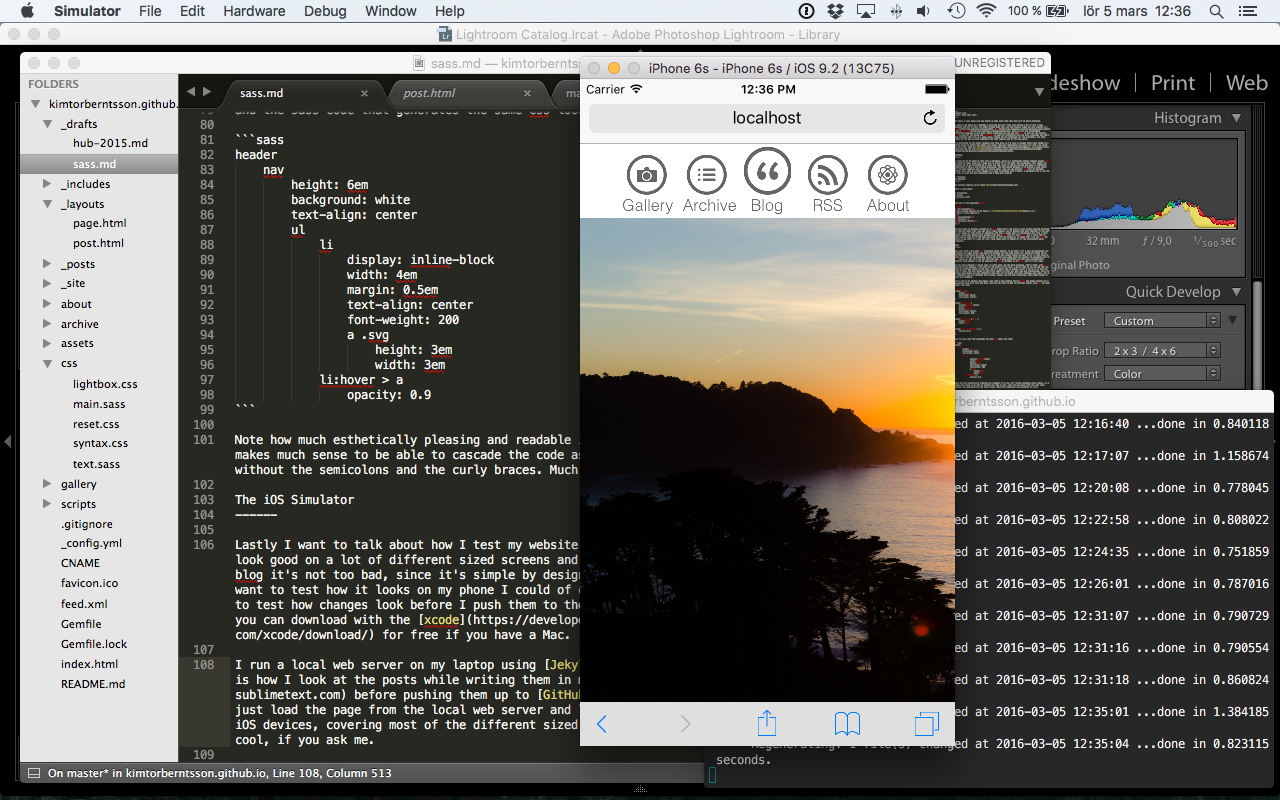
I run a local web server on my laptop using Jekyll from the command line. This is how I look at the posts while writing them in my favorite text editor Sublime before pushing them up to GitHub. Using the simulator I can just load the page from the local web server and look at how the site looks for different types of iOS devices, covering most of the different sized screens people could use the site from. Really cool, if you ask me.
28 February 2016
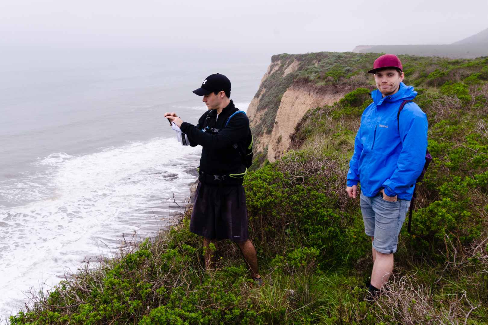
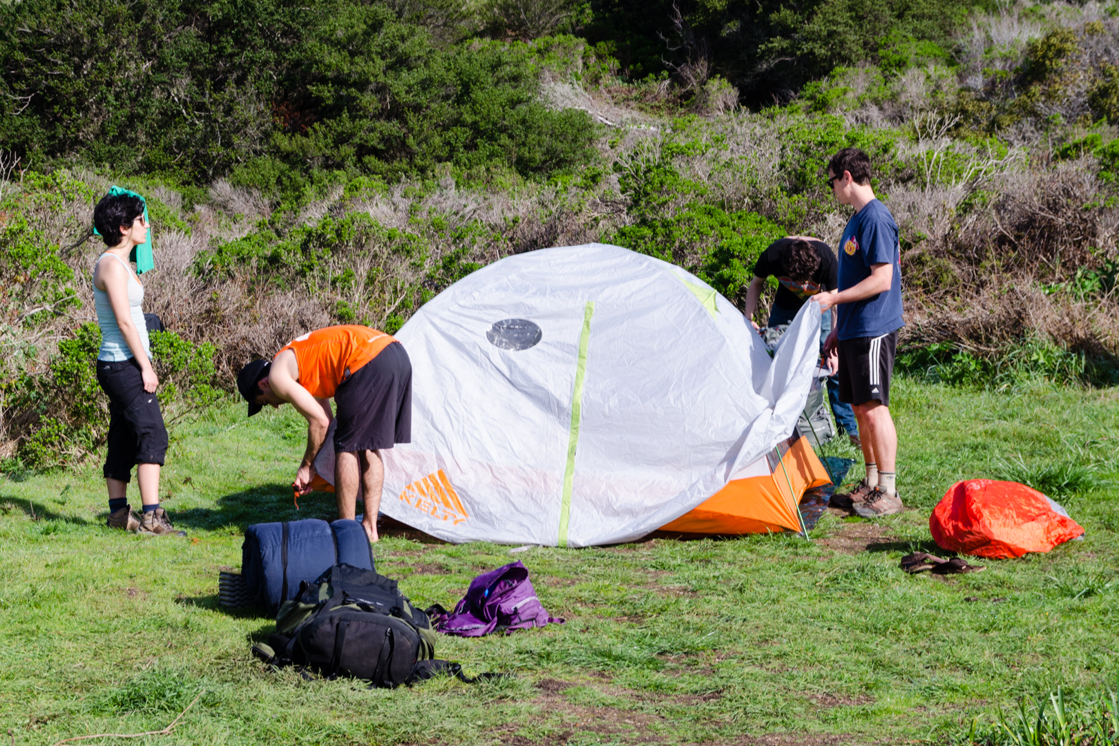
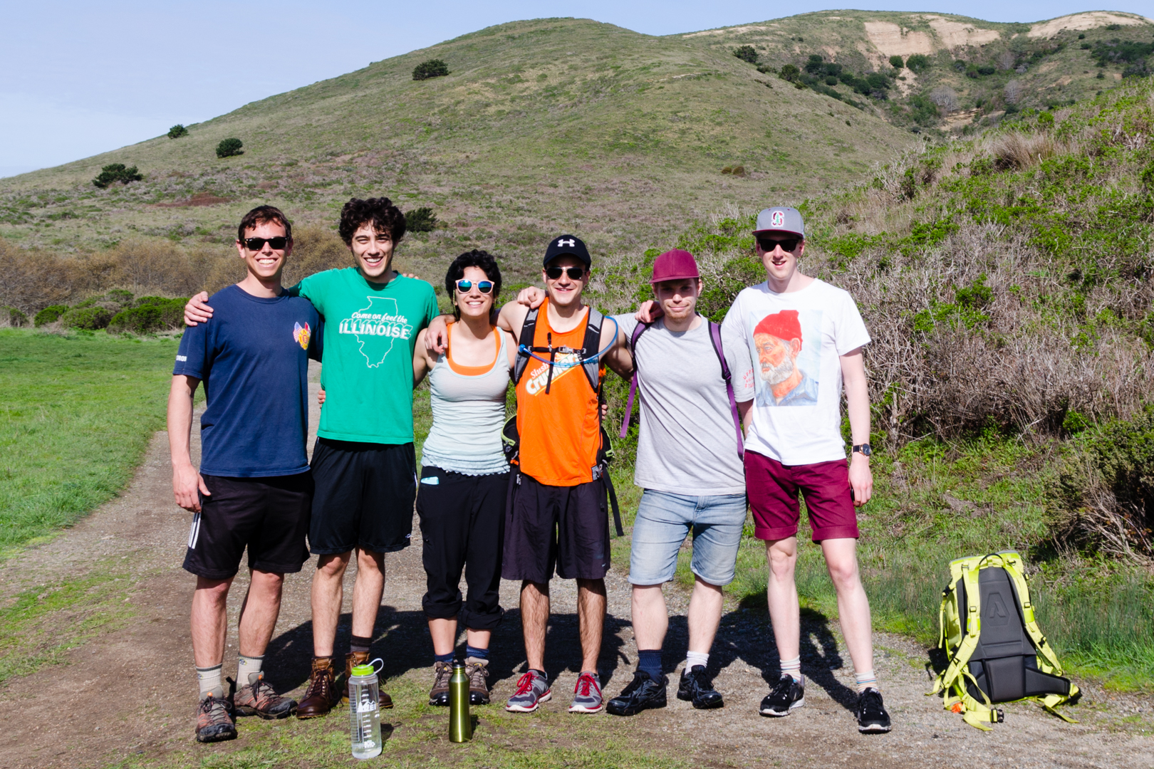
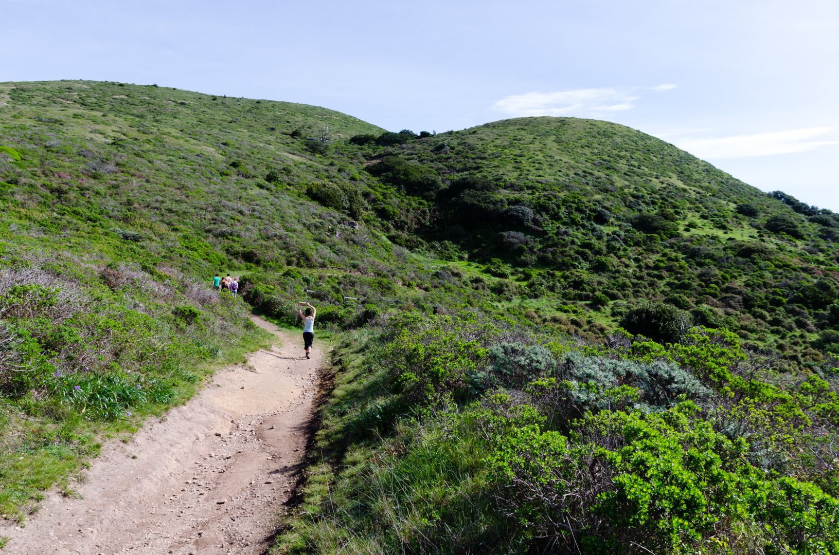
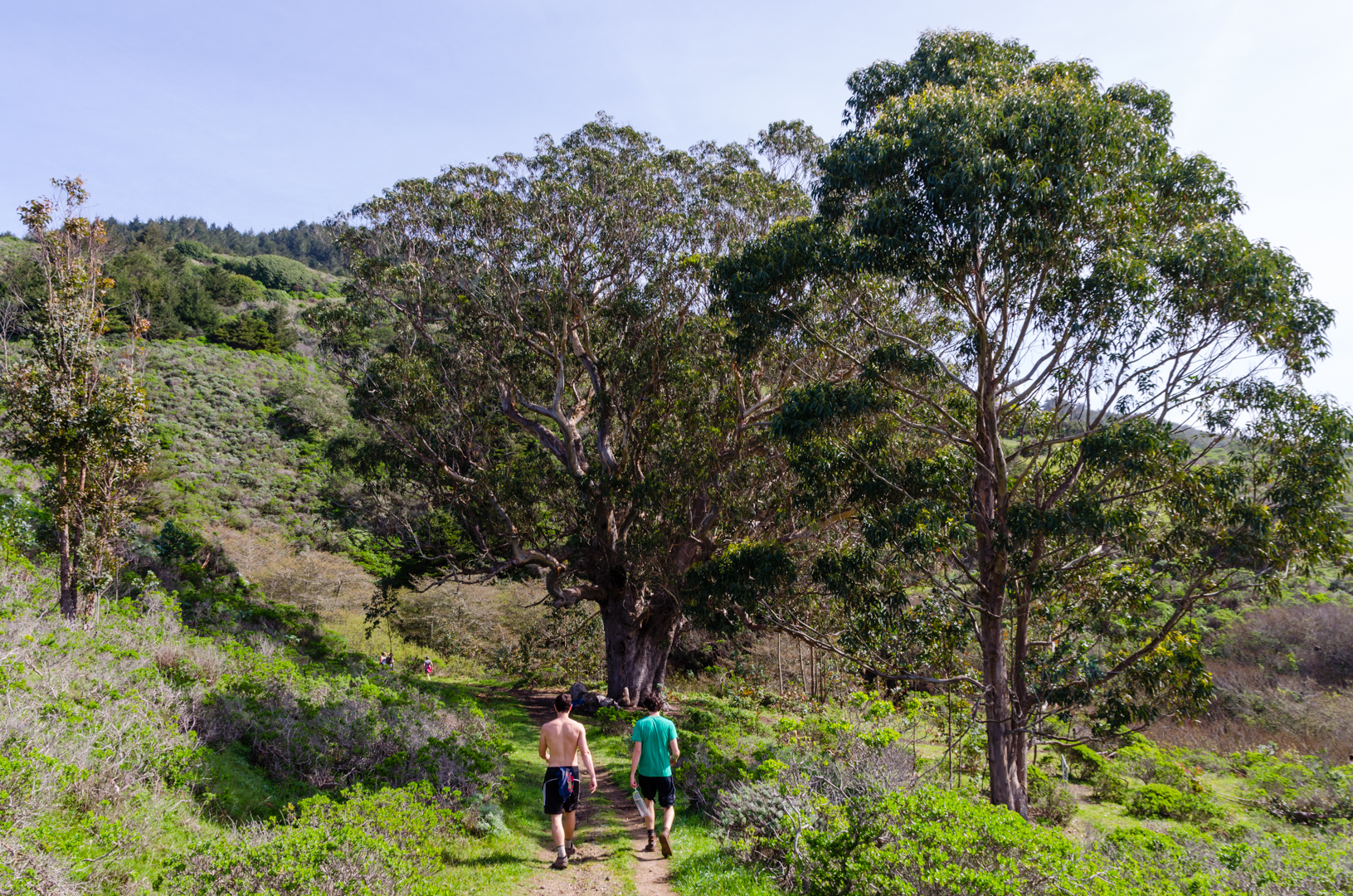
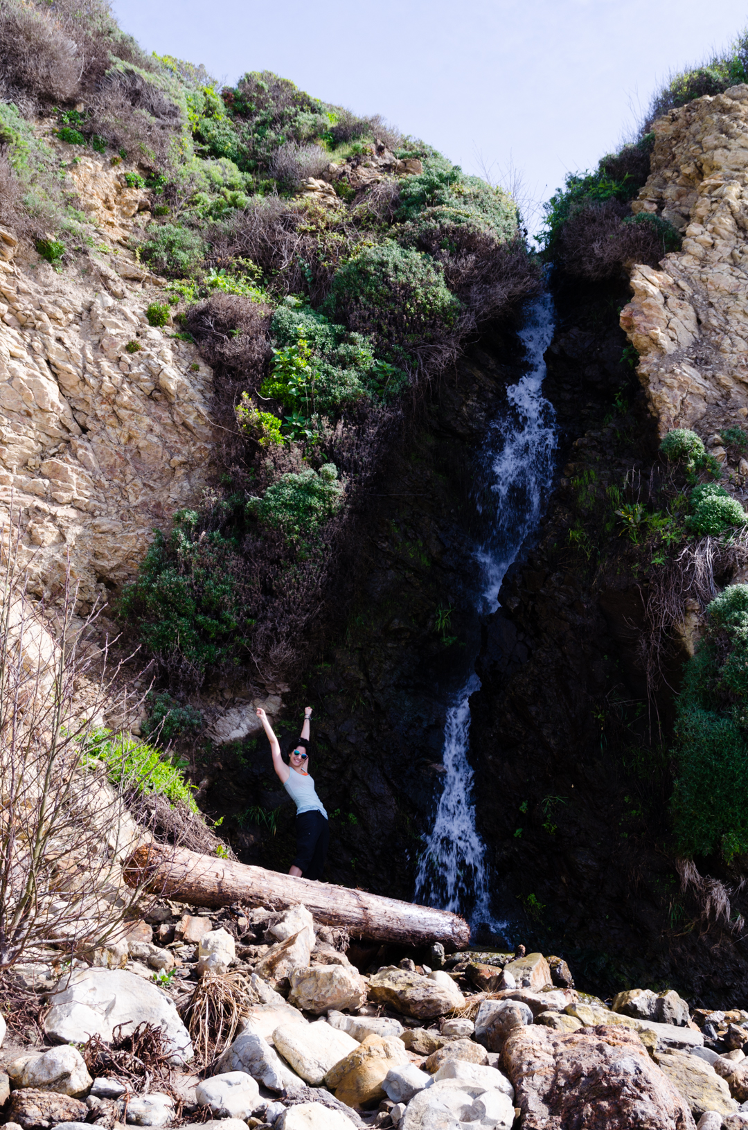
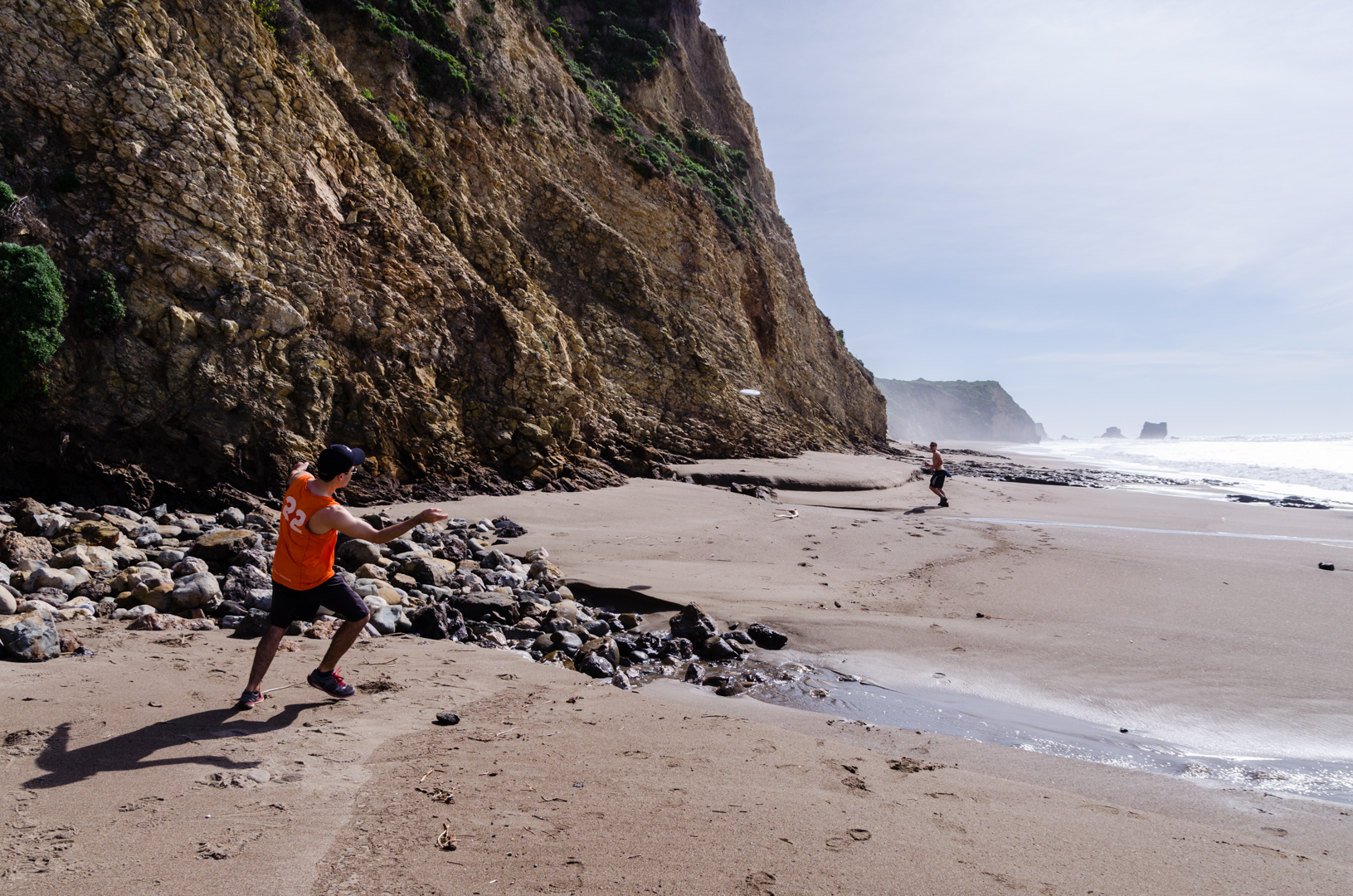
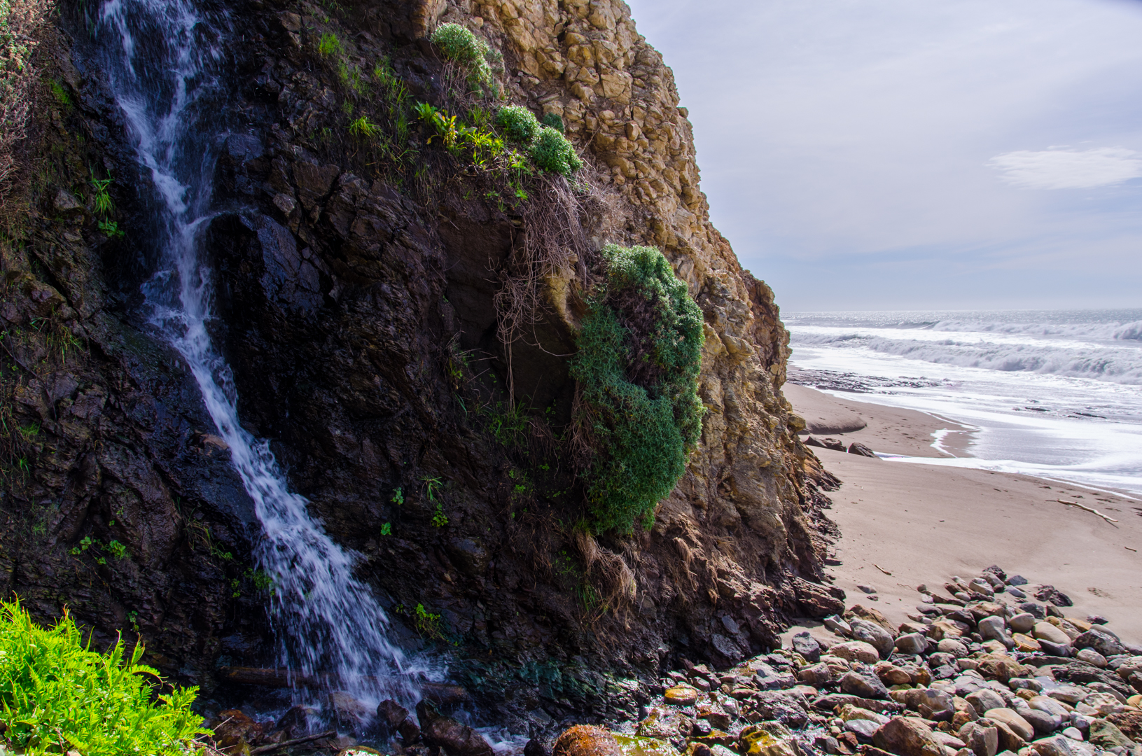
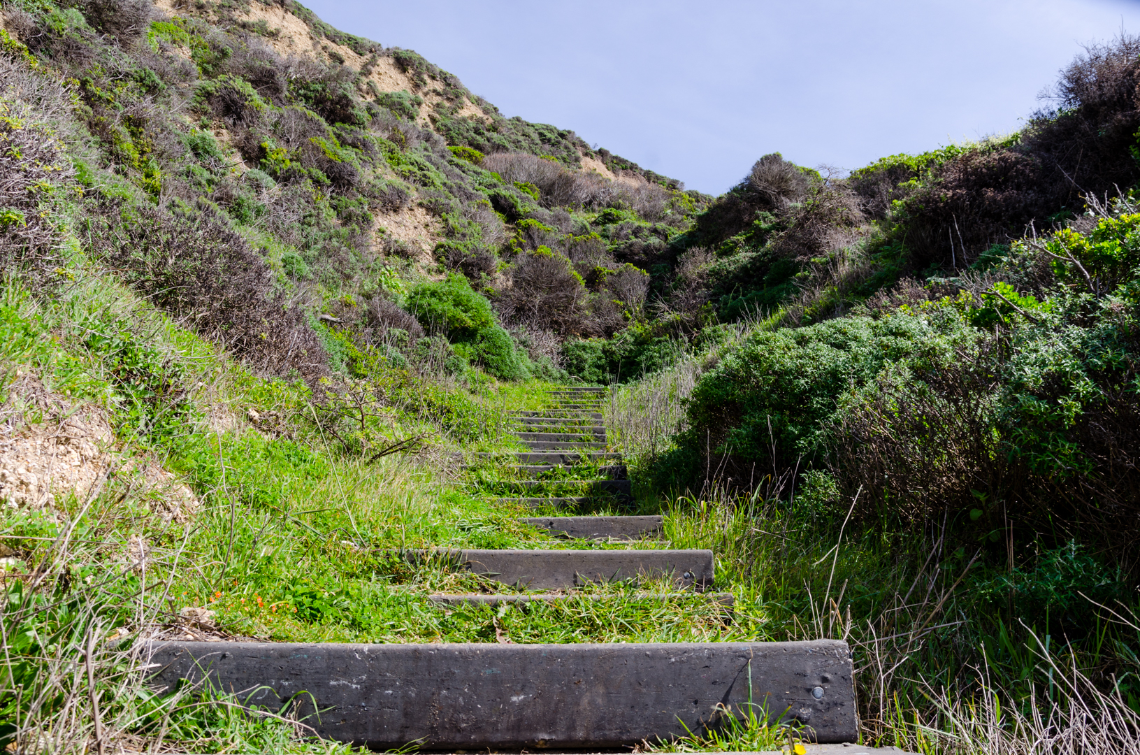
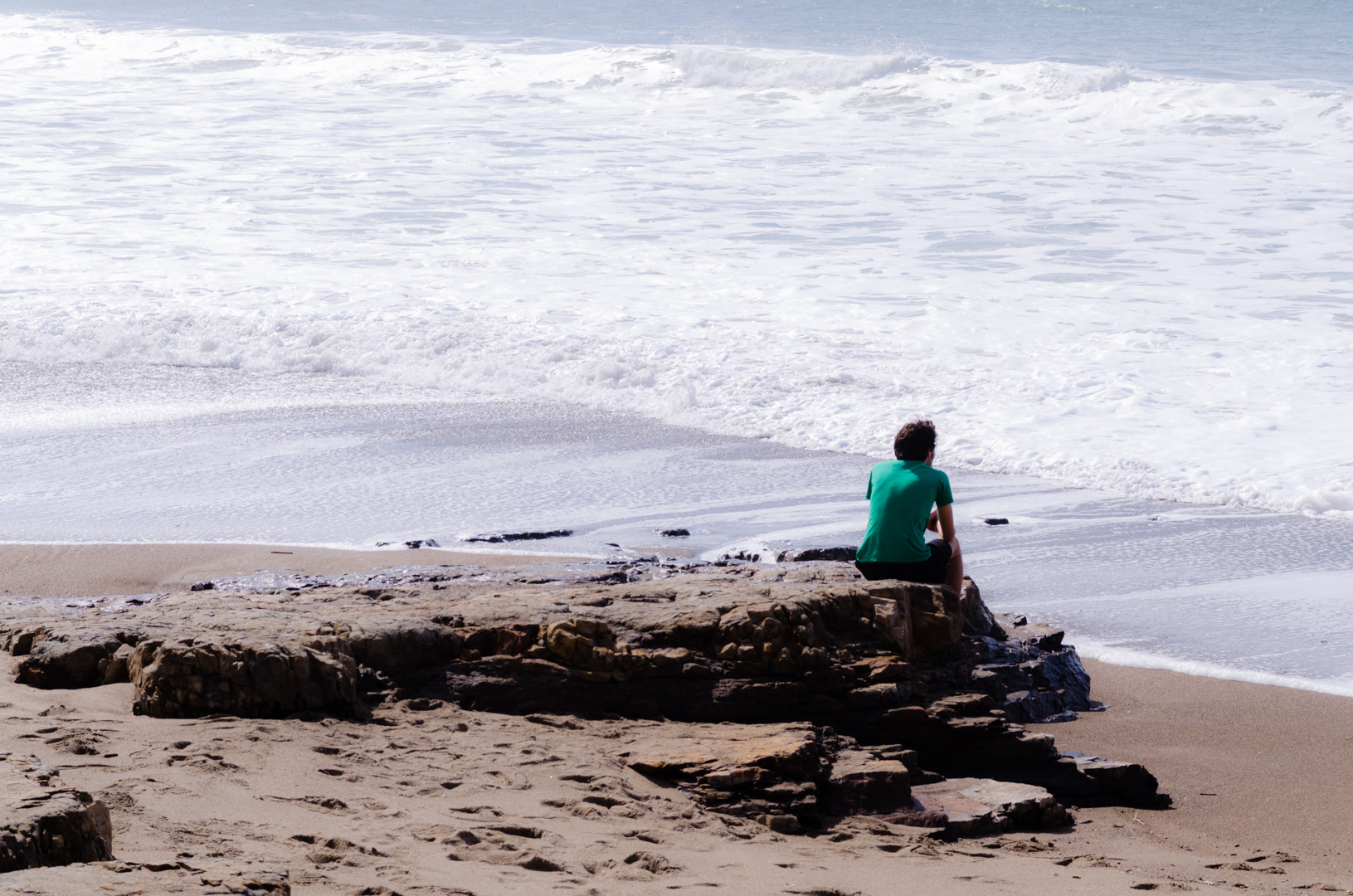
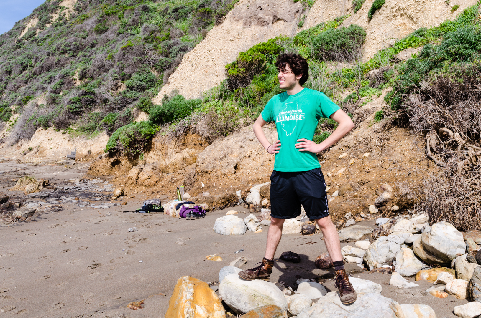
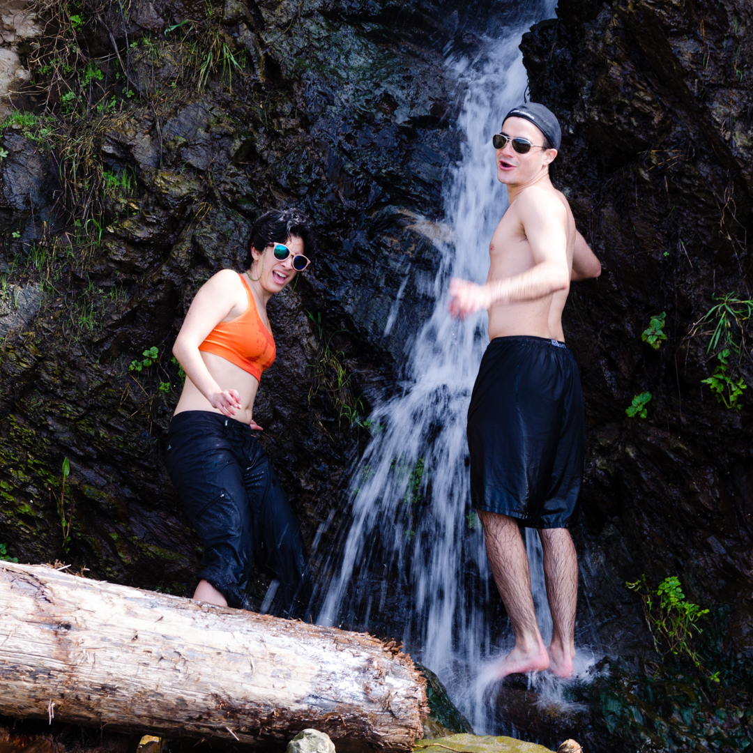
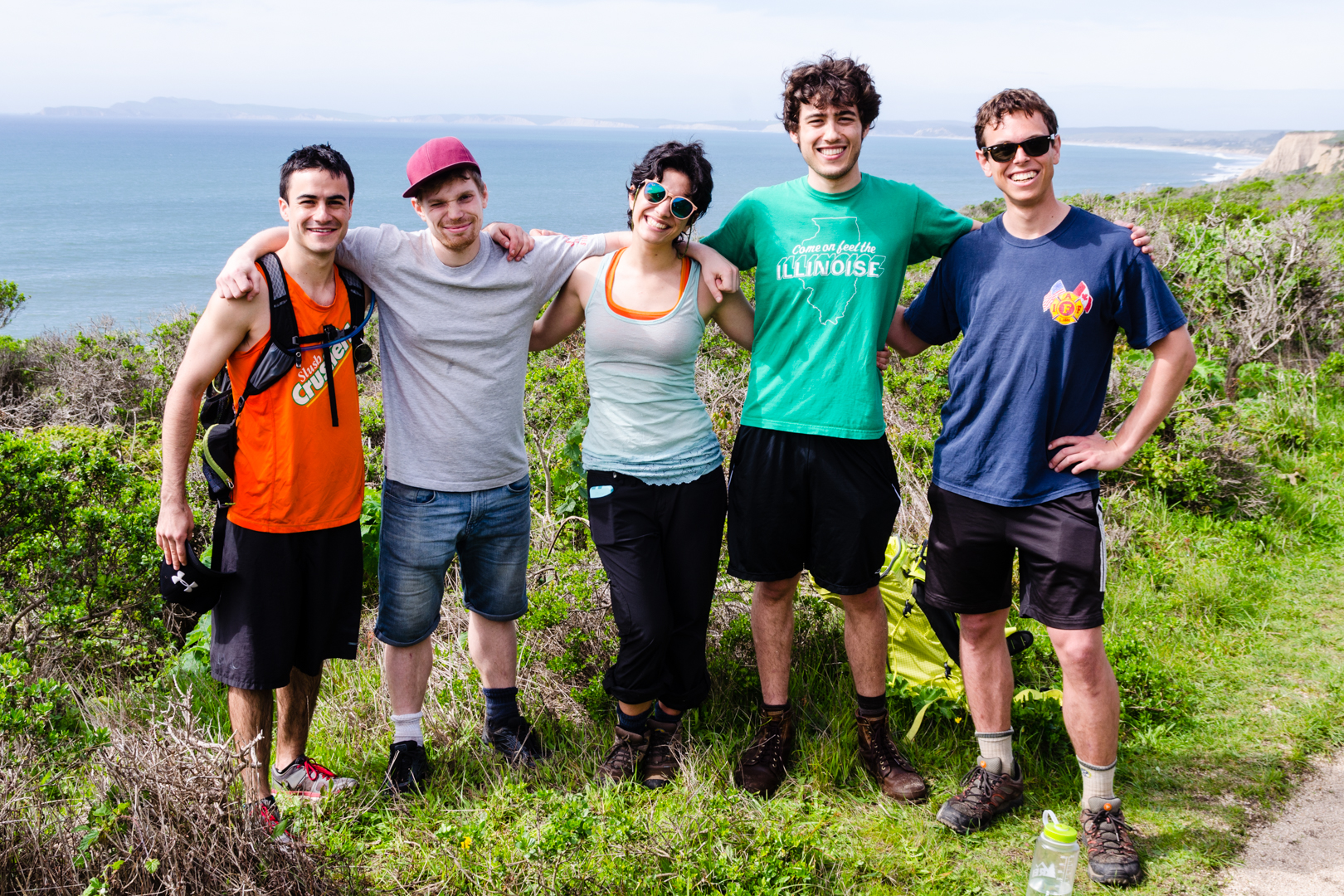
Me and Vidar have been talking about going hiking for a couple of weeks now and this week it finally happened. We went to Point Reyes together with Brent, Cansu and Roger from the office and with Reid, an electrical engineering student also at Stanford. As an unexperienced camper it was amazing to go with some incredibly nice and helpful people, who really helped with everything from the packing, food, tips and with a ride to the park as well. So thanks a lot guys!
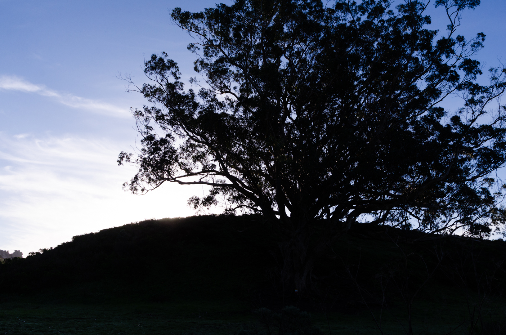
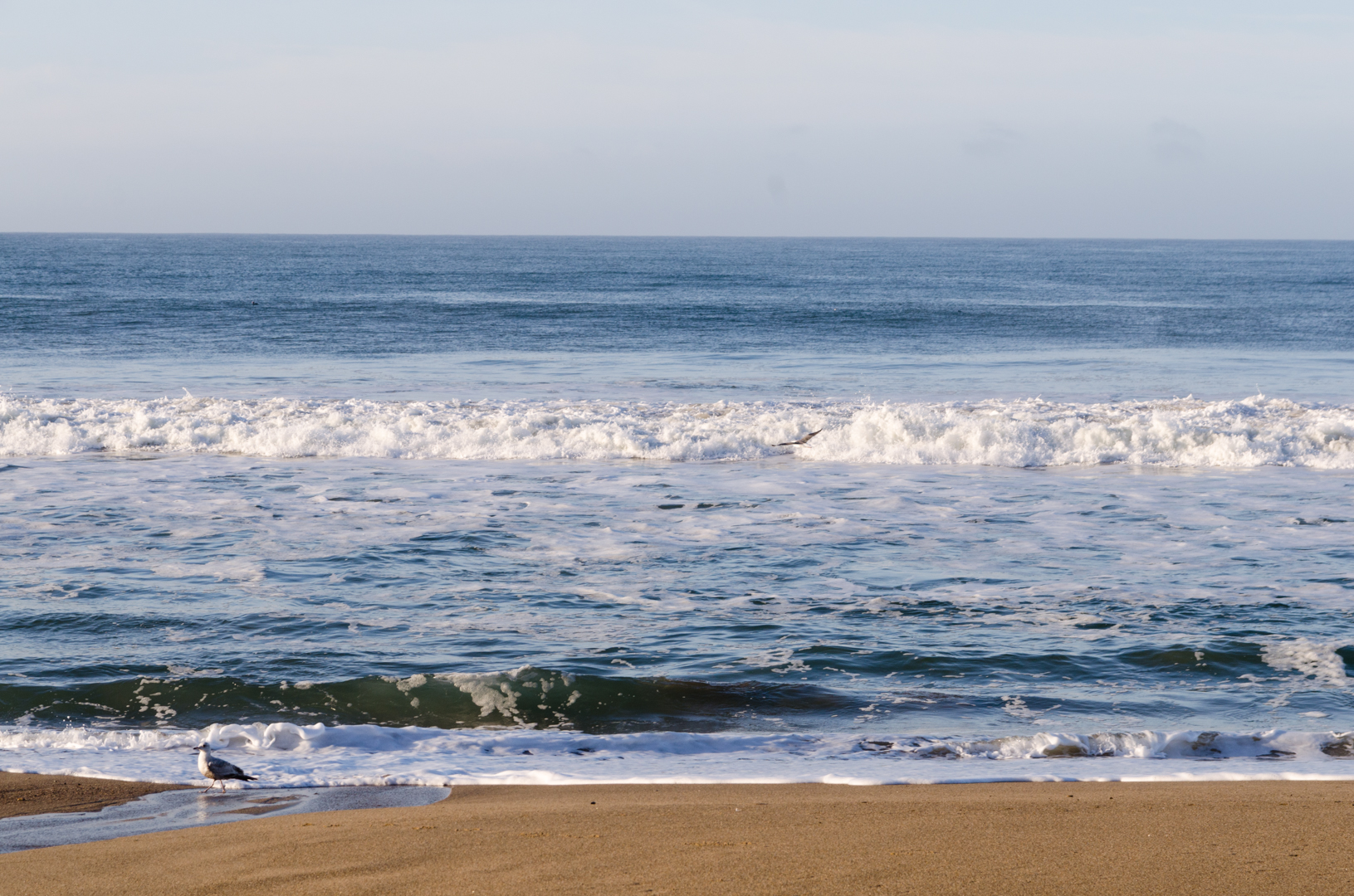
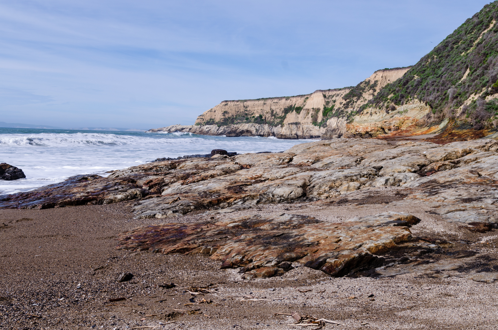
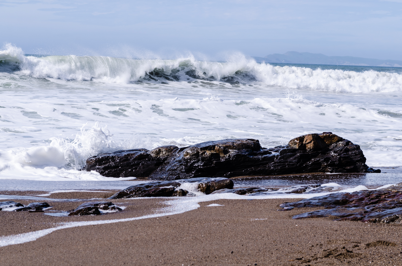
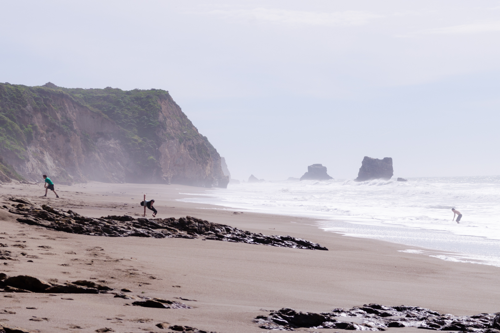
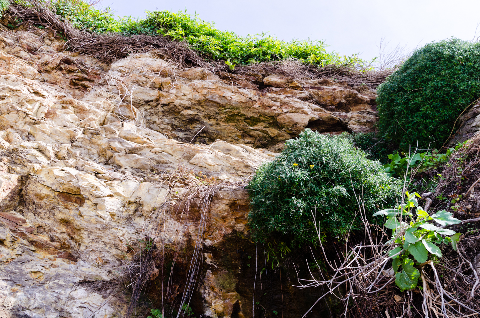
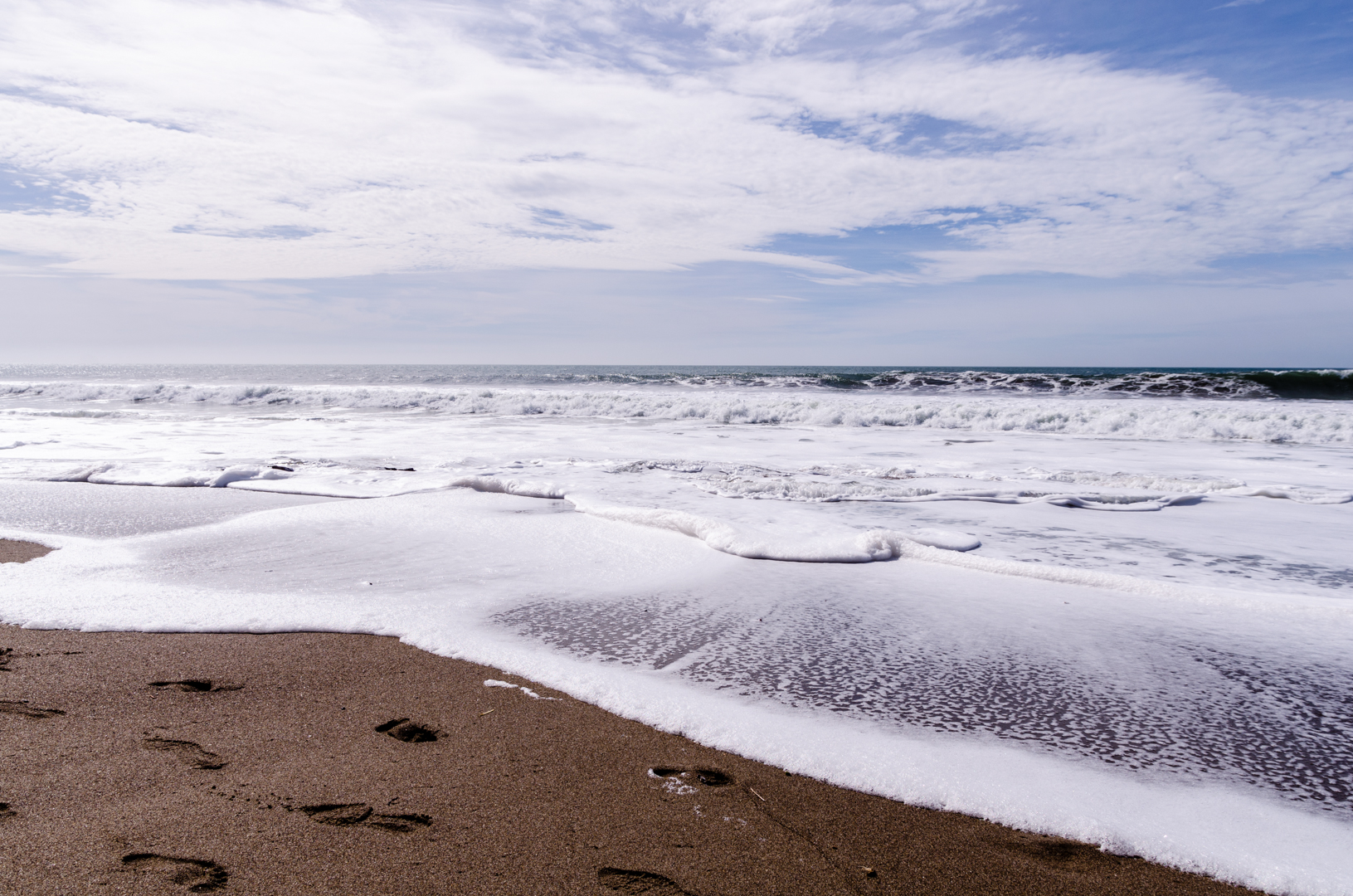
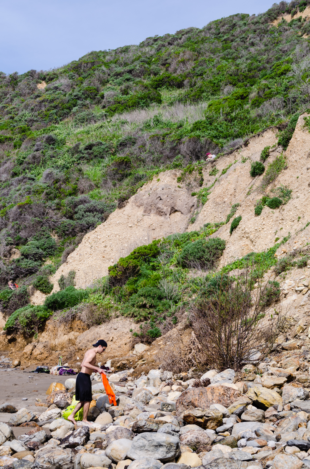
The first day the weather was kind of crappy, with lots of really moist clouds that drenched everything in a really smug and evil manner. You hardly felt the rain but in a few hours you were soaked. Me, Vidar and Reid arrived earlier on Friday and took a shorter hike, but the view wasn’t amazing because of the weather. Next day when we returned though, we saw the area in all of it’s glory. We went for a hike down to the beach a couple of miles from our camp, where we just enjoyed the view for a while. Then we returned to the camping spot, had lunch and walked to the cars.
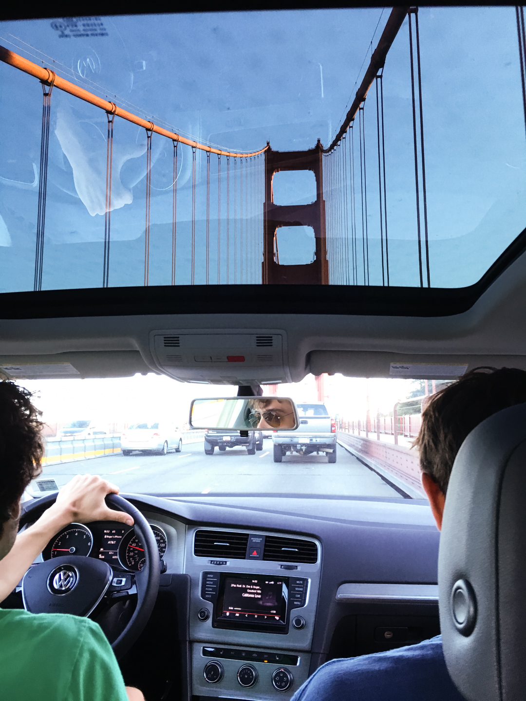
On the way back me, Brent and Roger drove along the coastline on some amazing roads on the way to the Golden Gate Bridge. It was one of the coolest roads I have ever been on and a great way to end the trip. We had a burger at a nice English pub in Palo Alto before they left me of at my place. I had a shower and had one of the better nights of sleep ever. It felt so good to rest after lots of walking and new impressions.
21 February 2016
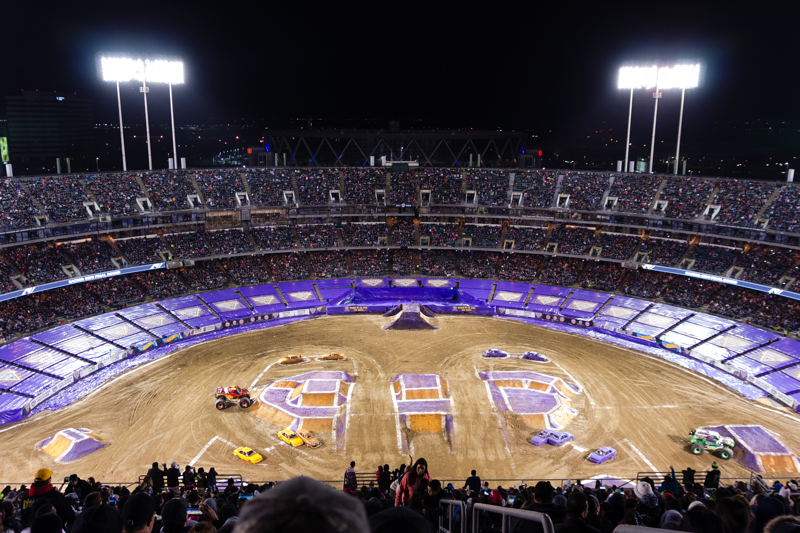
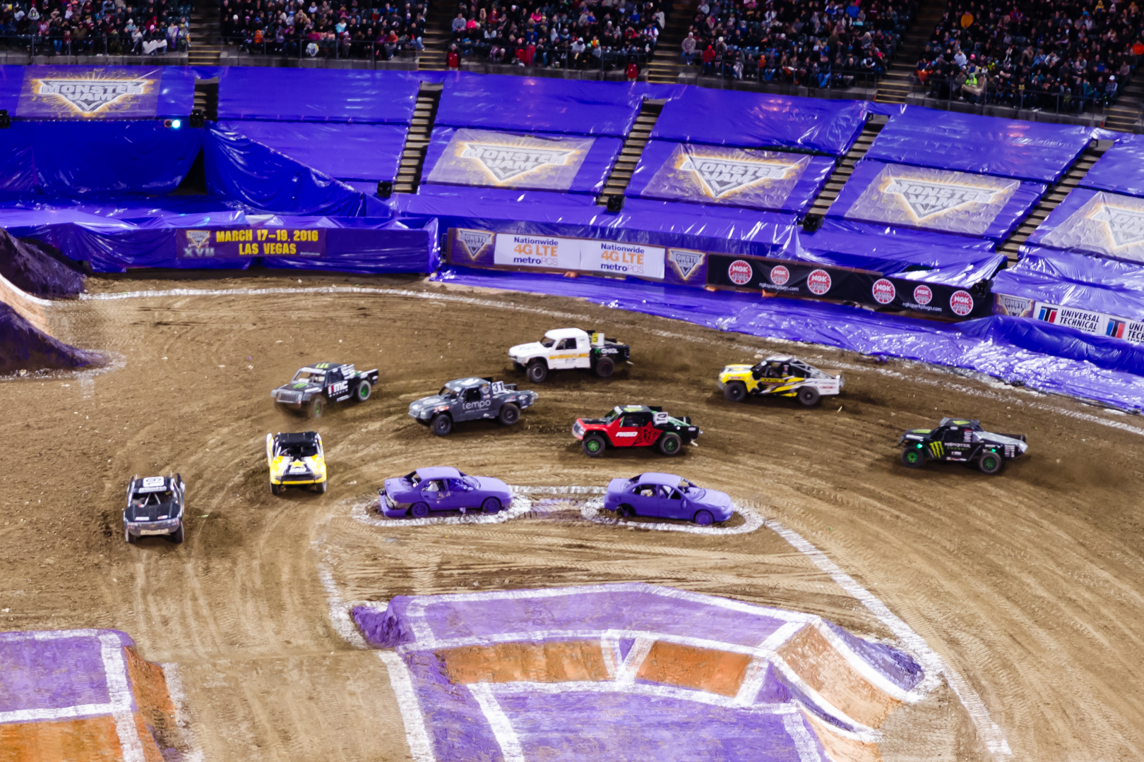
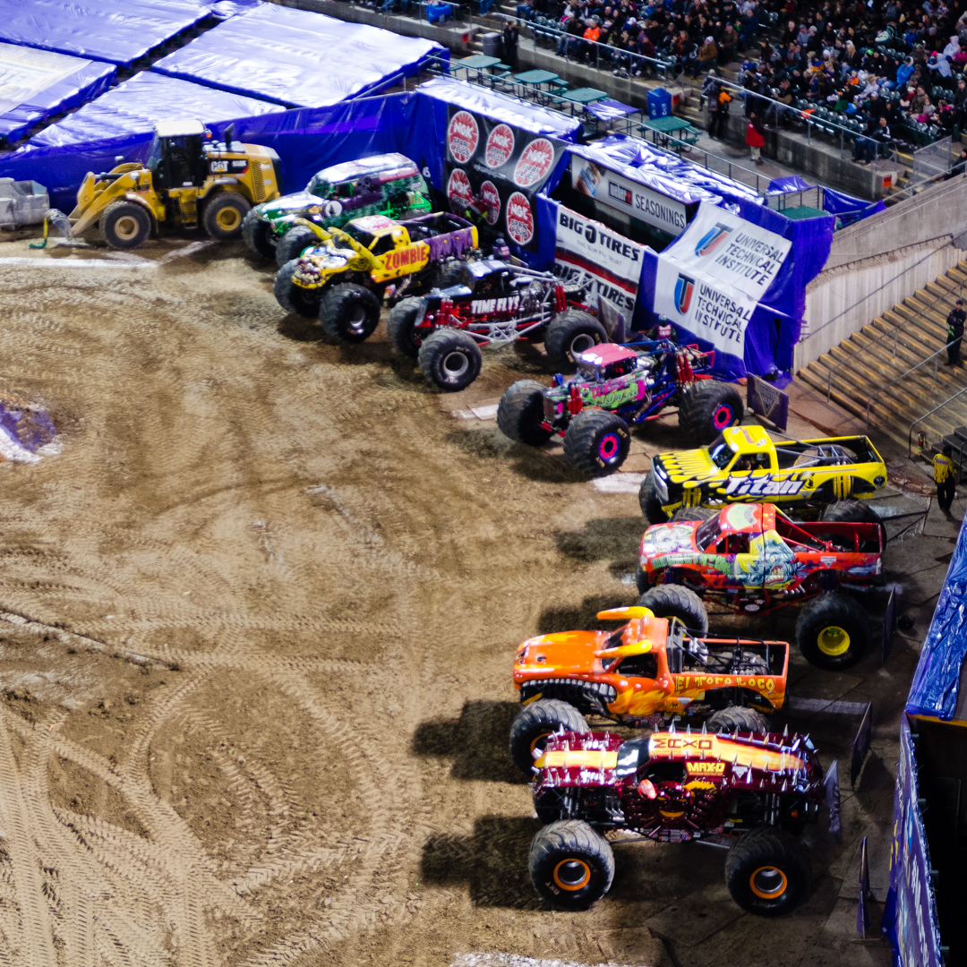
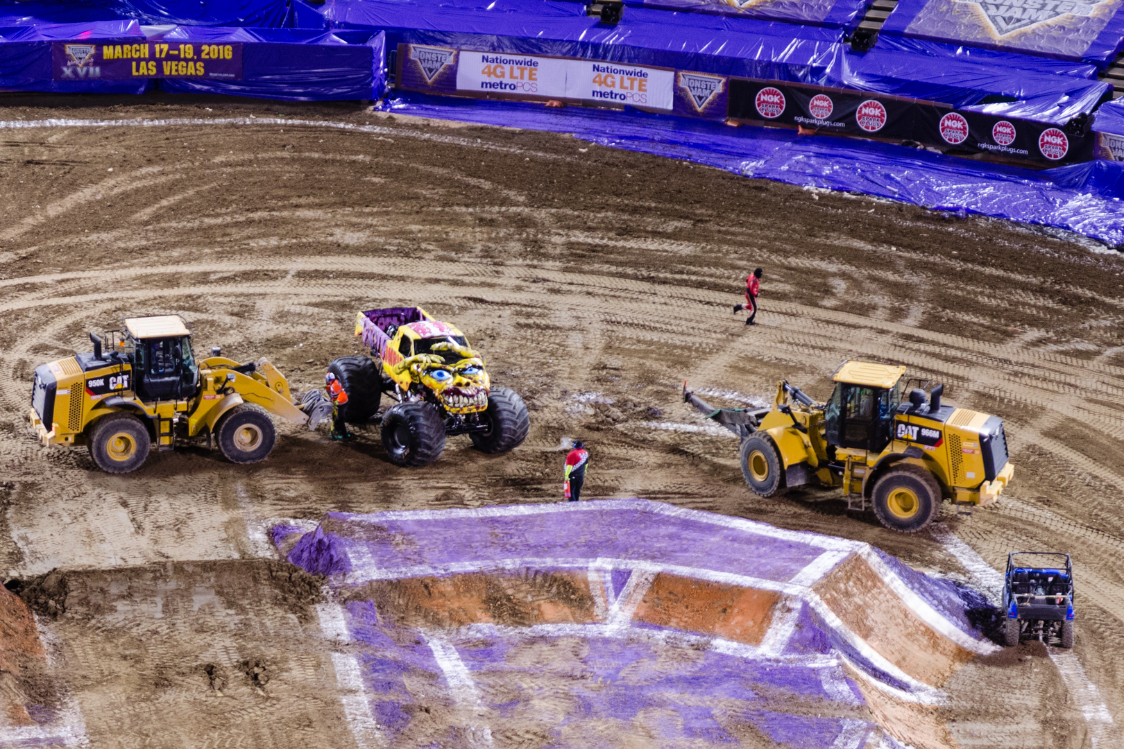
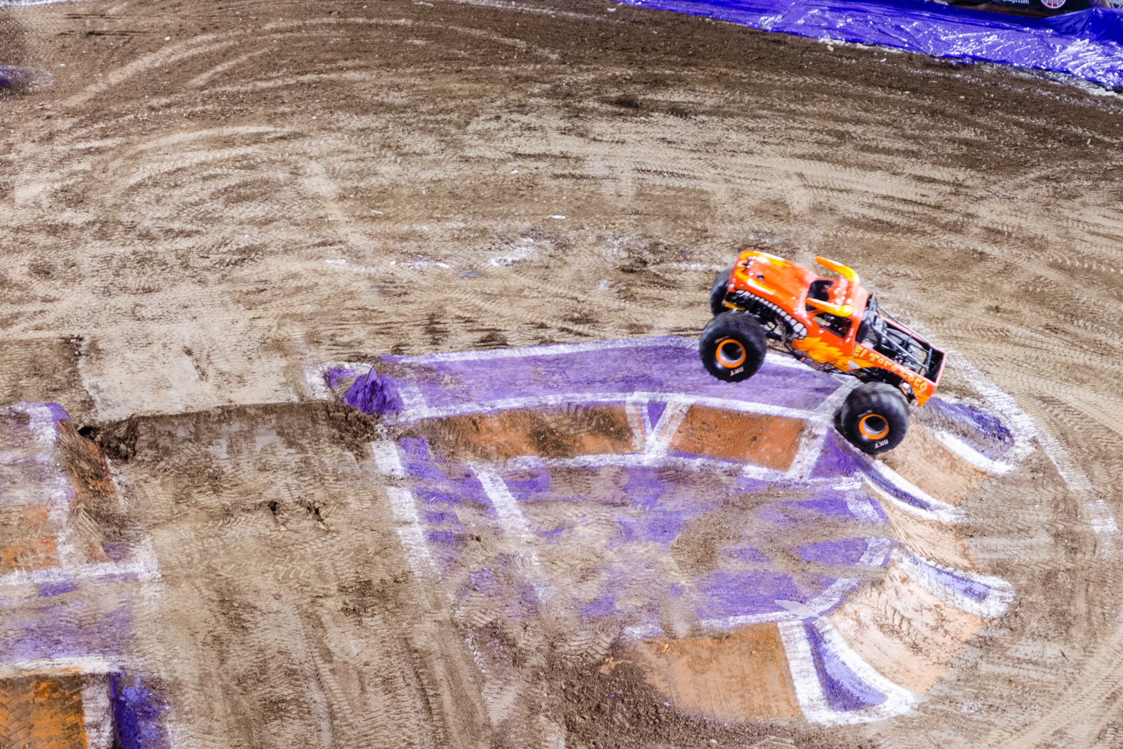
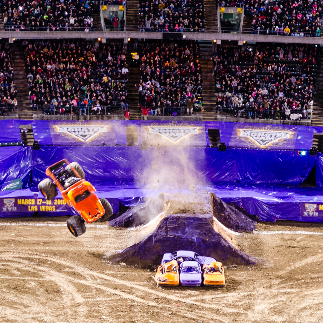
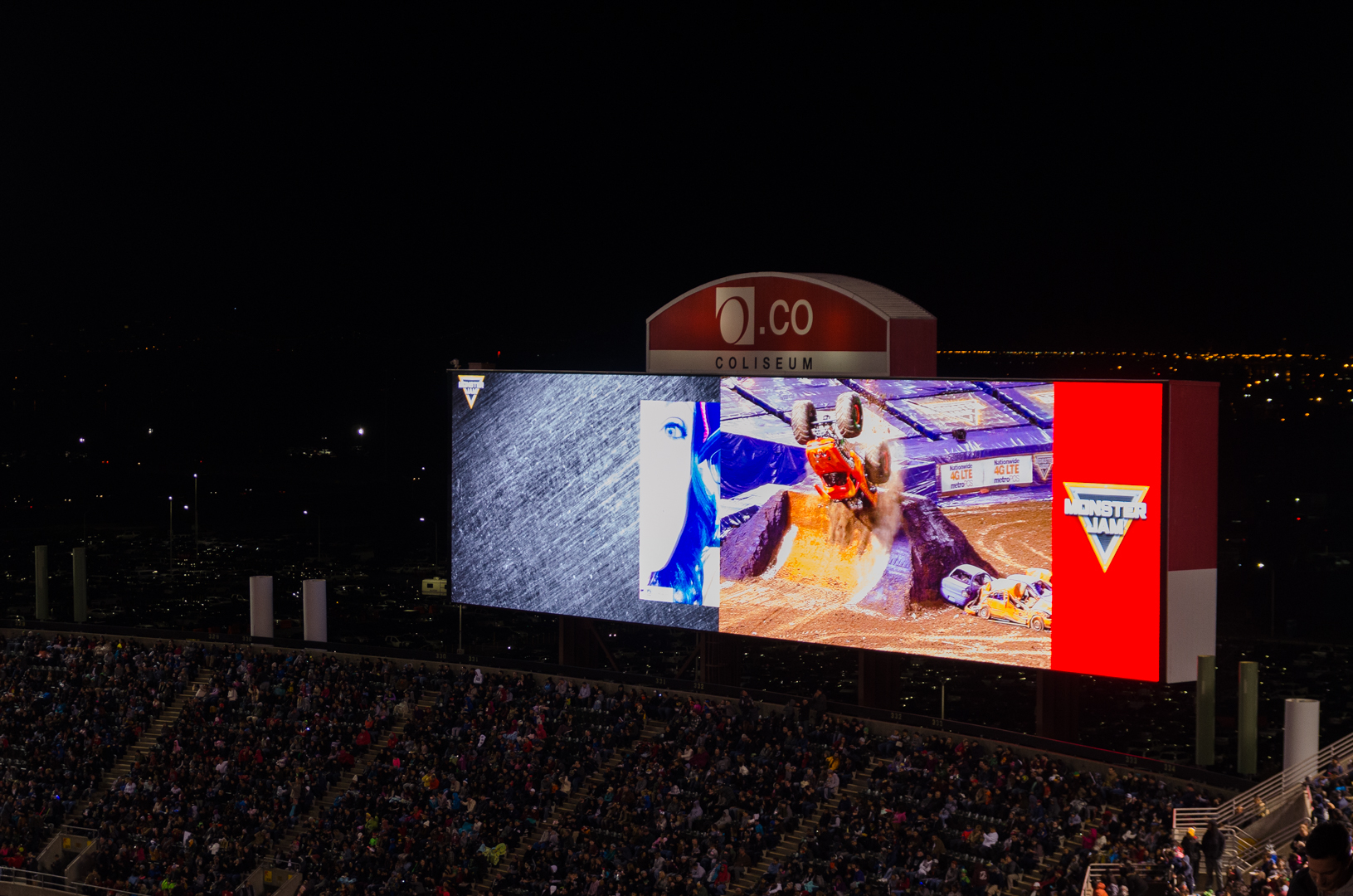
Another weekend with more typically American activities. This Saturday a couple of people from the Earth Science Department (where I work) went to see some Monster Trucks. It was like a childhood dream and actually I remembered the truck Grave Digger from the TV shows that I saw in Sweden a long time ago. We went to the Monster Jam in the most Californian way possible, in an electric car. We ate great food at a vegetarian restaurant, found a place to charge the car and then we took an uber taxi the last bit to the arena.
You could say that we started of as Silicon Valley hipsters, but then went straight for the loud, pubertal and perhaps a bit rural (I love how the commercials were all centered around different vehicles) aura of a Monster Jam. Speaking of loud, the first thing I reacted to was how incredibly loud the engines of the trucks were. It was really as much an audible experience as a visual one and together with the huge arena and all of the people, it felt pretty cool. I definitely enjoyed the show, which never felt too slow or boring. I would say it was right in the middle of being a sport and being a show and of course it was perfectly packaged for the younger audience. Even if I’m not really down with the chopper culture, it was loads of fun and I’m glad to have experienced it.
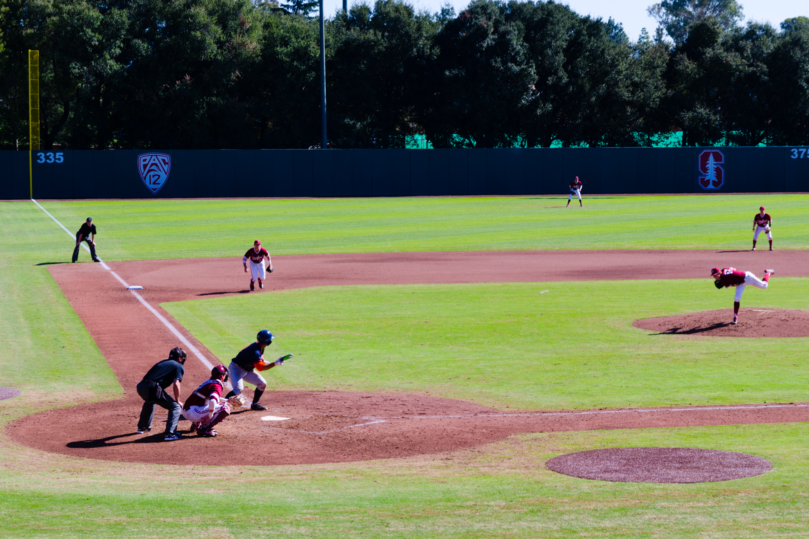
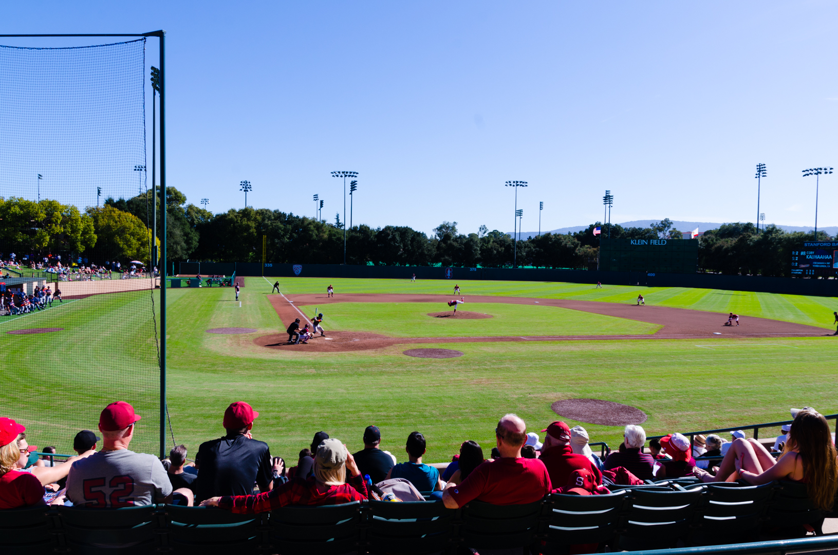
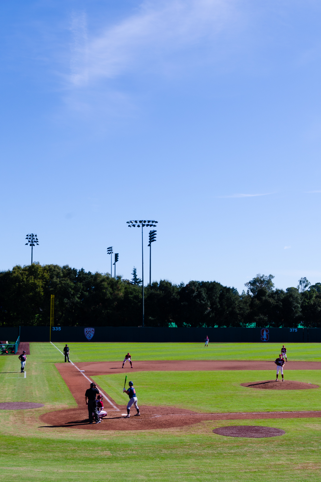
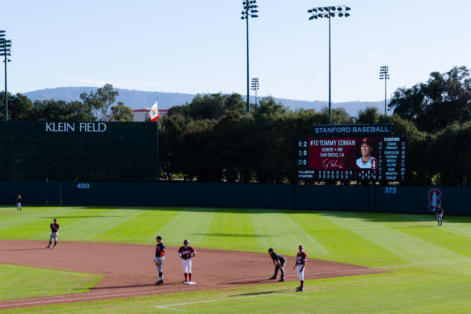
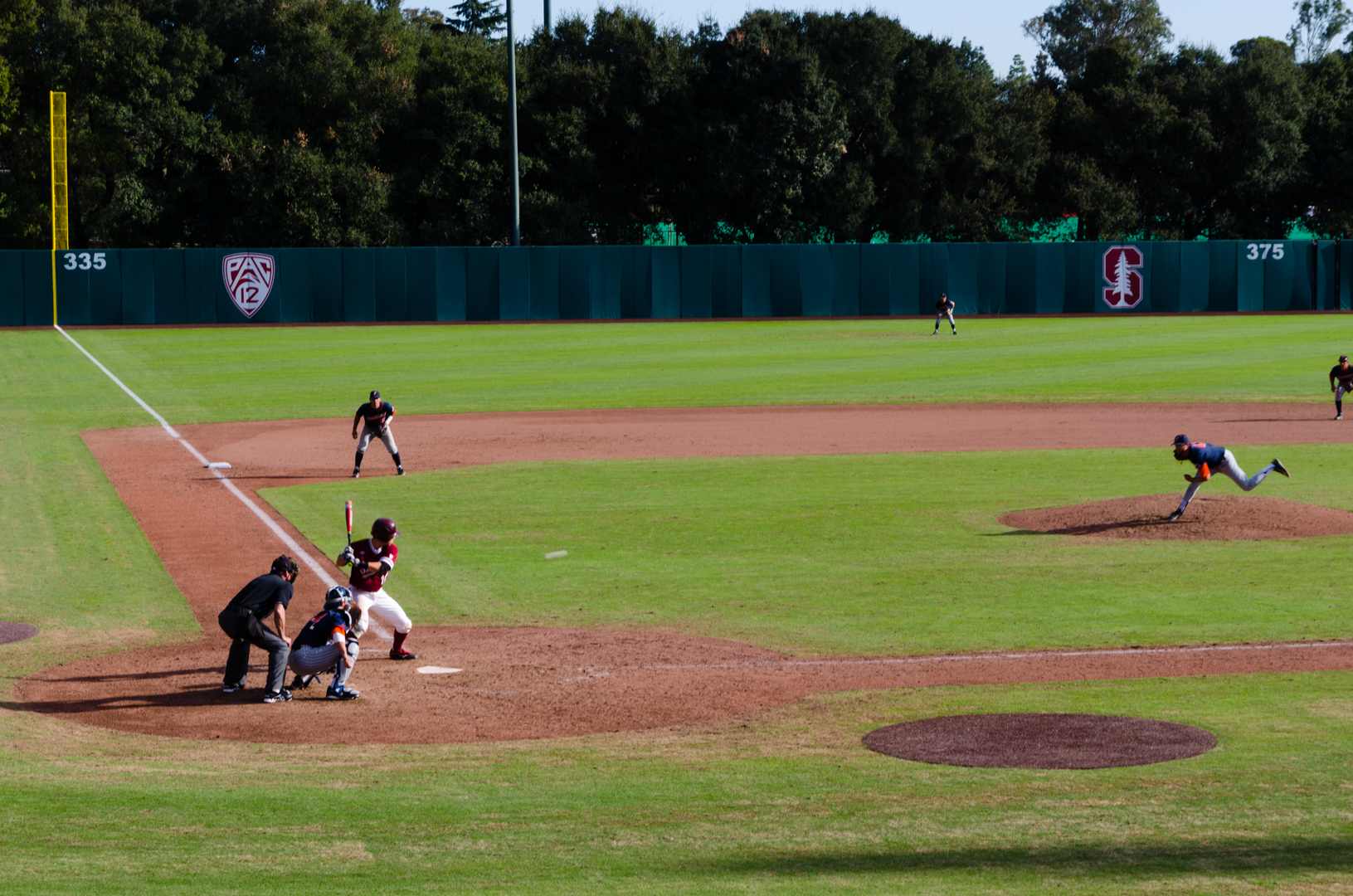
On Sunday me and Vidar watched a game of baseball on campus at the Sunken Diamond. It was a stunning day, which became painfully clear when I arrived home and realized that I had burned my right arm, the right side of my neck and the inside of my left thigh. Beach 2016 here I come! Unfortunately Stanford lost to California State, so we were not as lucky as with the basketball game last weekend. All in all, another great weekend!
16 February 2016
Hi there guys, maybe you have already noticed, but the blog looks a bit different now, right? I have been thinking about redesigning the blog for a while now and last night I finally got right into building what I call the 3.0 version. So here are the release notes. I’m going to write about the changes I made this time and why I think they improve the overall experience, so if you’re not interested in that you can stop right here.
Right when i started this project a couple of years ago I wanted to build a blog from the ground up, but at that time I didn’t have the tools for it. You can’t really build anything complex with just html and css, at least not efficiently. So instead of a blog I made a little site about me. I had some pages with a few photos, information about myself and my resume.
For the second release I added a blog area using Jekyll and kept the old pages. I needed a few subpages for the blog so therefore I added a second navigation bar under the background section. This looked alright esthetically I think, but it wasn’t great conceptually. And now that I’ve lived with the 2.0 version for a while, I feel like the pages with the photos and the resume makes less and less sense.
The page with the resume was really annoying to maintain. Whenever I wanted to add something to my resume I had to add it to my pdf-resume, to LinkedIn and also to the homepage. It seemed like a lot of redundant extra work and therefore it made sense to remove it from the site. I have a link to my page on LinkedIn in the footer, so the info is still available, just in a better place.
Next I had a page with a couple of photos. The weird thing with that page was that you could not find any of the photos from the blog, so it was completely separated from that part of the page, which I think was both confusing and inelegant. So that made me think, maybe I could have a page that collects all of the photos from the blog. Well, that’s exactly what I did. I call this page the Gallery, so if you want to look at the pictures this is where to go. You can get to the full posts from this view if you want to by clicking on the headers.
What’s left after these changes is basically the blog. Since it is now (finally) clear that this is really a blog, it made sense to merge the blog navigation into the original navigation bar at the top. I think that all this makes much more sense than before, and that everything feels more consistent now.
While I was at it I decided to add some additional small artistic changes. First of all, I had this epiphany that maybe you could have the background from the latest post as background for the start page. In the end I decided that the pages that list a couple of posts per page (five in my case) should use the background image from their latest post. I think this was nice, because you can notice that the background changes as you browse through the pages. Also you can see whether or not you have read the latest post, since you’ll notice a new background if you have not.
As a final touch I worked a bit more with the colors of the site. Generally I’m careful with the coloring, since I want to keep things clean and simple. I also have lots of photos with varying color schemes in them, meaning that it’s practically impossible to use colors that work with every possible photo. That said, I used quite a lot of orange when you hovered around the site with your mouse, but if you’ve been browsing on a phone, you might not have noticed this at all.
I like the orange highlighting, but I wanted to take things one step further, so I decided that every page should have it’s own color scheme. The arrows, links and headers all use the color theme of it’s own page. I think of it as playful without being too childish, but I guess that a few of you might disagree about that. Anyway, now the Gallery, Archive, Blog and the About pages all have their distinctive color schemes. The icons of the footer also have some new coloring when you hover over them.
I’ve actually changed a couple of things under the hood as well, but I think I will write something short (hopefully) about that further along. Thanks for bearing with me. Next post will probably be about Monster Trucks, so stay tuned.