Three Cool Tools
Hi there, I just wanna warn you before we even start that this post will be quite technical.
I spent a few hours on a redesign a while ago and now I feel like sharing a bit of what I have learned from all of this. You might already know this, but the browsers today are very limited to html, css and javascript, which are all old technologies oftentimes annoying to work with. Really simplified you can say that html is used for the content, css is used for the design and javascript is used for interaction with the site. Sometimes you need a big framework that sits as a layer above, hiding the old technology for the programmer, but other times you can get by using something that just removes some of the ugly parts.
I’m definitely in the latter category with this site, so I’d like to present three tools (might be a weird choice of words) that makes life easier (and most importantly much more fun) when I do things on this site. They are Markdown, sass and the iOS-Simulator.
Markdown
I write all of my posts on this site in Markdown, which is a lightweight markup language format. Html is based on tags, which are a huge pain to write all of the time. Each paragraph, link, header and picture has to be surrounded by at least one tag, which is really annoying and makes it completely impossible to have a nice writing experience. The idea behind Markdown is to provide a nice syntax for the most commonly used tags for writing posts. Then you can generate html from the Markdown files. Let’s look at a short example of a post in Markdown with a header, a paragraph with a link and a list, so that you guys understand what I mean more clearly:
My Homepage
------

My personal website can be found [here](http://kimtorberntsson.com).

Here I write about:

* Programming
* Movies
* Personal stuff
And here is the generated html:
<h2>My Homepage</h2>
<p>My personal website can be found <a href="http://kimtorberntsson.com">here</a>.</p>
<p>Here I write about:</p>
<ul>
<li>Programming</li>
<li>Movies</li>
<li>Personal stuff</li>
</ul>
Writing posts in Markdown instead of in html means that I can write my post without getting disturbed by tags and other crap. This was just a short example, and it becomes even more important if you want to use images or code blocks or something like that. I guess that I’m approaching this from a weird angle, since most people would probably just use a blog site for their blog. But it feels cool to have control over all of the code and build it from the ground up. It means that I can use html and build my own stuff if I want to, but I have these tools to handle all of the inconvenient parts elegantly.
sass
Now let’s talk a bit about css (cascading style sheets). To be blunt: it’s a hell and absolutely not intended for human beings. You would not believe how hard some things are. Centering things can be extremely frustrating and since it is one of the more common things you want to do, it just blows my mind how it can be so hopelessly stupid. You could also argue about how helpful the cascading part of css really is, but let’s not get into that now. I would definitely say that sass (synthetically awesome style sheets) is not as important for css as markdown is for html, but it’s still neat.
It has three features I really like. To start with, you can have variables. That’s right, with css you can’t! For example, I use this for the colors of the site. I define them at the top and then use them at different places in the site. And if I would like to change a color I can do it in just one line of code. The sass syntax is much nicer (which is after all what they are insinuating), since the stupid semi-colons are gone (hopefully they will all be banned from every language soon (well, who am I kidding?)) and the redundant curly braces. Lastly, you can nest properties, which makes things so much more readable.
Let’s look at an example once again, this time a real example from my blog. The header section has a navigation area with icons and text, that you can press to get to different places. With css the code looks like this:
header nav {
    height: 6em;
    background: white;
    text-align: center;
}

header nav ul li {
    display: inline-block;
    width: 4em;
    margin: 0.5em;
    text-align: center;
    font-weight: 200;
}

header nav ul li a .svg {
    height: 3em;
    width: 3em;
}

header nav ul li:hover > a {
    opacity: 0.9;
}
and the sass code that generates the same css looks like this:
header
    nav
        height: 6em
        background: white
        text-align: center
        ul
            li
                display: inline-block
                width: 4em
                margin: 0.5em
                text-align: center
                font-weight: 200
                a .svg
                    height: 3em
                    width: 3em
            li:hover > a
                opacity: 0.9
Note how much esthetically pleasing and readable it is now. It’s called cascading style sheets, so it makes much sense to be able to cascade the code as well. Also note how much nicer the code looks without the semicolons and the curly braces. Much more simplistic and welcoming for sure.
The iOS Simulator
Lastly I want to talk about how I test my website on phones and tablets. Today you want your site to look good on a lot of different sized screens and it can be a challenge to design sometimes. For a blog it’s not too bad, since it’s simple by design (unless you’re a really crappy designer). If I want to test how it looks on my phone I could of course just browse to my site, but I want to be able to test how changes look before I push them to the real site. For this I use the iOS SImulator that you can download with the xcode tools for free if you have a Mac.
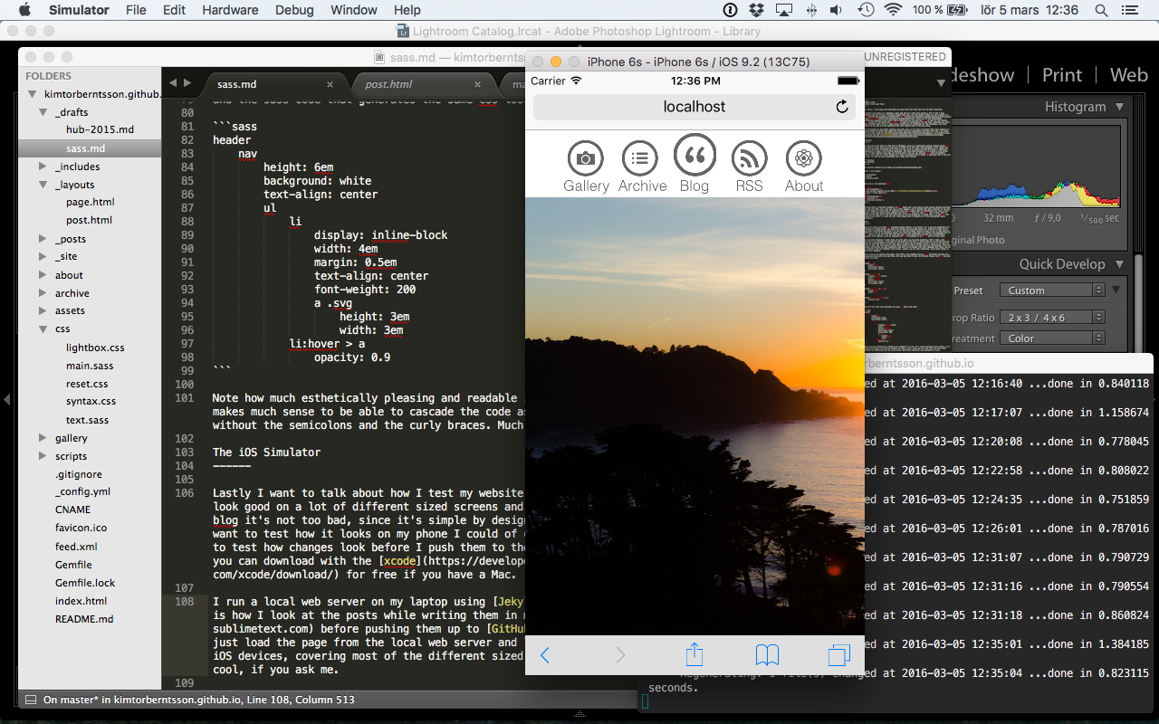
I run a local web server on my laptop using Jekyll from the command line. This is how I look at the posts while writing them in my favorite text editor Sublime before pushing them up to GitHub. Using the simulator I can just load the page from the local web server and look at how the site looks for different types of iOS devices, covering most of the different sized screens people could use the site from. Really cool, if you ask me.